
Who are KOTOK?
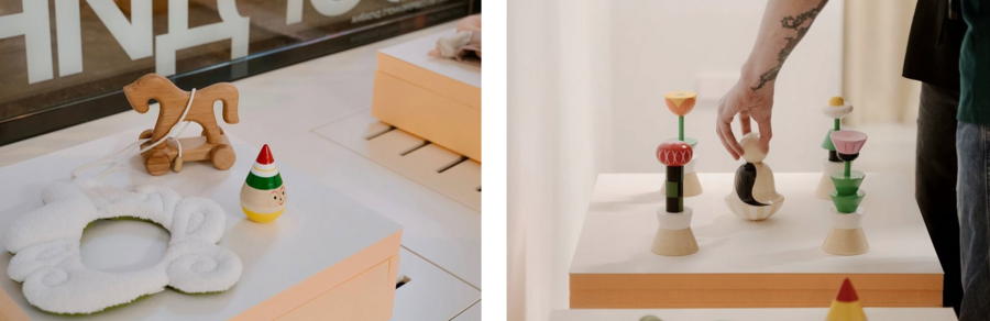
It is a small independent brand that deals with wooden toys and decorative items. The central idea is nostalgia, packaged in the frame of a design experiment. KOTOK takes archetypal images — tumbler, matryoshka, spinning top — and reassembles them through a modern design look, without losing recognition of the original source. This is not a restoration of tradition or a denial of it, but a conversation with it in a new language. At the same time, the brand makes interior items — candlesticks, jewelry boxes, key rings, that is, it constantly balances between a «toy», a «souvenir» and a «design object». This ambivalence is part of the brand’s message. The main audience is adults with an interest in design, local brands and rethinking Russian aesthetics. They buy such things for themselves / for the interior as a design object, as a gift or for a child. Additionally, there’s a craft element involved — handmade, natural wood, safe paints, cooperation with the artel of craftsmen. The products are presented as collectibles.
Communication processes
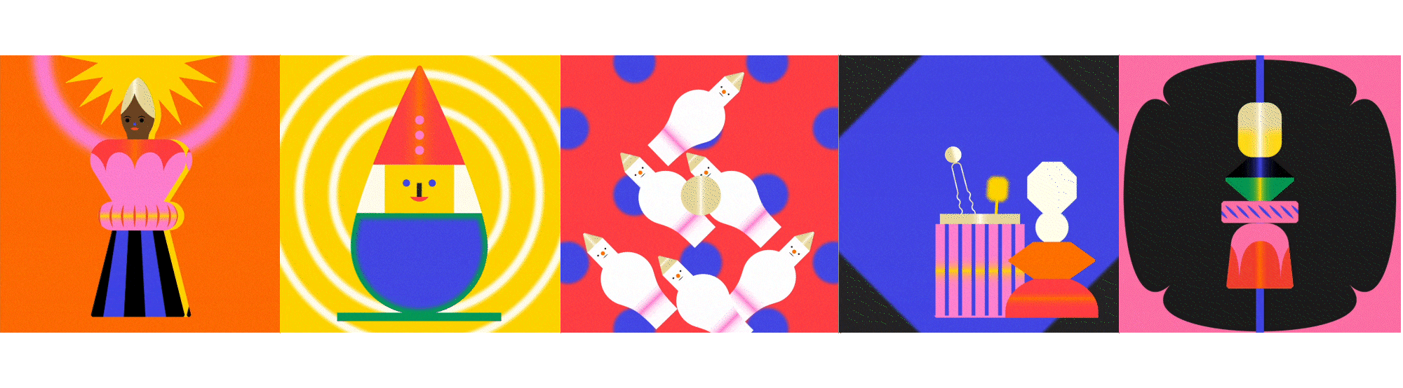
KOTOK builds a very cohesive visual image. They share a common color palette, a recognizable and pleasant illustrative style, and a playful name.
KOTOK is promoted through its own website and social networks. Similarly, the brand describes itself as a «project» and «research» rather than a store.
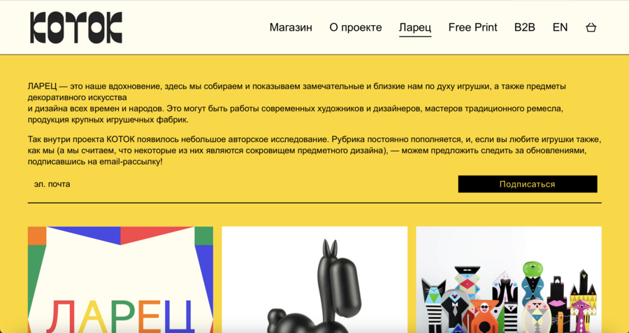
The site is generally standard — it contains information about the brand, a separate section with products and contacts. This is the main entry point, which exists in two language versions for the Russian and international markets. The English version is similar in structure to the Russian one, just focused on the international buyer and connected to the Etsy audience.
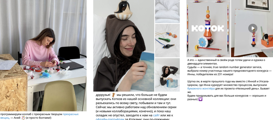
The product is also broadcast through social networks, as well as participation in exhibitions and production. Collaborations with different partners (AF Brew, ASK Studio, Koshta Collective, LILIPIL, GES–2 etc.) allow to attract a new audience.
It turns out to be a classic model: the product is sold through several parallel channels, social networks are used for advertising and communication with the audience.
Choosing a communication theory
For the analysis of KOTOK, it would be useful to consider two theories that complement each other and cover communication «from both sides» — from the brand’s perspective and from the audience’s.
The first is Dialogic Theory: This theory is directly about how an organization builds relationships with an audience through a website and online channels, and offers a specific set. The dialog loop the usefulness of information, the generation of repeat visits, the intuitiveness of the interface and the «retention» of visitors on the site. This is suitable for a brand that has all the communication and has a website + social media.
The second is the theory of Uses and Gratifications: She looks at communication from the audience’s perspective. What people get when they subscribe to a brand and read its content is nostalgia, a sense of belonging to a cultural component, and aesthetic pleasure. This theory allows us to check whether the channels that KOTOK has chosen are really giving the audience what they need.
Together, these two theories provide a complete picture of the brand’s communication strategy. Dialogic theory shows how well the «infrastructure» of a brand’s relationship with the audience is organized. The theory of use and satisfaction is how much this infrastructure corresponds to why the audience comes to the brand in the first place.
Application of communication theory
Let’s go through the basic principles of dialogic theory.
The website has a feedback form, an invitation to send feedback and suggestions, and a separate page for partners who want to host their products. But this is more of a «mailbox» than a live dialogue: there is no visible FAQ, no chat, no public answers to questions. This real dialogue takes place on social media through comments. Intuitiveness is well maintained — the site structure is logical, there is an explanation for foreign and Russian audiences. The brand provides all the necessary information about itself, this information is duplicated and presented slightly differently on two different sites for all types of audience. The brand is also actively introducing interactive elements — for example, you can assemble a keychain in their style yourself on the website.
Visually, the brand has a very solid design. There is a distinctive language in communication and texts, beautiful presentation, memorable illustrations. Special attention is also paid to the photo style, which is also very important in the context of the presentation. All these elements create a common assembled image that attracts and endears the audience.
When analyzing KOTOK’s content through the prism of the audience’s needs, you can see that the brand covers several types of «satisfaction» at once.
The main thing is the recognizable shapes of children’s toys of the past, presented in a new aesthetic. This has the effect of returning to childhood, but not too intrusively.
The need for self-actualization/It is realized in the fact that a person does not just buy a toy. You can make a personal collection. Observation/curiosity is satisfied by the fact that the brand openly speaks to the audience in the media through posts. Membership in the community is achieved through collaboration with other independent brands, participation in exhibitions and festivals.
Conclusion
So, the brand has a solid visual identity, which it holds in media, design, and so on. For a small brand, this is a very good level of recognition and quality.
Sources
KOTOK [Electronic resource]. — URL: https://mtrl.io/brands/kotok-111?ysclid=mqe26dagey176721488 (accessed: 11.06.2026).
KOTOK [Electronic resource]. — URL: https://kotok.toys (accessed: 11.06.2026).
KOTOK Store [Electronic resource]. — URL: https://kotok.store (accessed: 12.06.2026).
The Concept of the Dialogue by T. Dridze as a Relevant Tool for Cross-Cultural Mediation in International Business [Electronic resource]. — URL: https://web.snauka.ru/issues/2013/07/25725?ysclid=mqe4p1joe6204128812 (accessed: 13.06.2026).
Uses and Gratifications Theory [Electronic resource]. — URL: https://media-studies.com/uses-gratifications/ (accessed: 12.06.2026).
10 Mass Communication Theories According to Experts [Electronic resource]. — URL: https://sinaumedia.com/10-mass-communication-theories-according-to-experts/ (accessed: 12.06.2026).
KOTOK Playthings [Electronic resource]. — URL: https://www.behance.net/gallery/105600721/KOTOK-Playthings (accessed: 11.06.2026).
KOTOK [Electronic resource]. — URL: https://mtrl.io/brands/kotok-111?ysclid=mqe26dagey176721488 (accessed: 11.06.2026).
Kotok Playthings [Electronic resource]. — URL: https://mastera.academy/kotok-playthings/ (accessed: 11.06.2026).
KOTOK [Electronic resource]. — URL: https://t-j.ru/kotok/?ysclid=mqe4afdwm4533128664&utm_referrer=https%3A%2F%2Fyandex.ru%2Fsearch%2F%3Ftext%3D%25D0%25BF%25D1%2580%25D0%25BE%25D0%25B4%25D1%2583%25D0%25BA%25D1%2586%25D0%25B8%25D1%258F%2B%25D0%25B8%25D0%25B3%25D1%2580%25D1%2583%25D1%2588%25D0%25BA%25D0%25B8%2B%25D0%25BA%25D0%25BE%25D1%2582%25D0%25BE%25D0%25BA%2B%25D0%25BD%25D0%25B0%2B%25D1%2584%25D0%25B5%25D1%2581%25D1%2582%25D0%25B8%25D0%25B2%25D0%25B0%25D0%25BB%25D1%258F%25D1%2585%26lr%3D213 (accessed: 12.06.2026).
KOTOK Playthings [Electronic resource]. — URL: https://kotok.toys/playthings (accessed: 11.06.2026).


