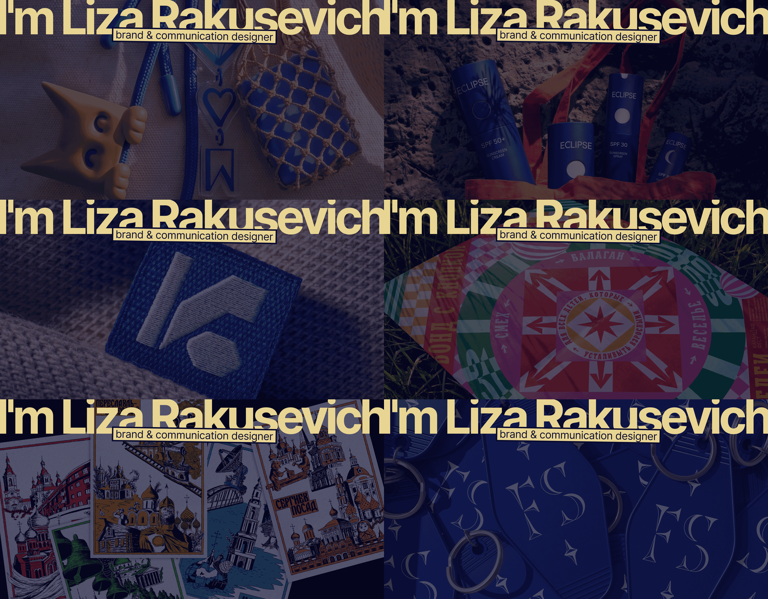
I find a unique visual language for brands:
from idea and metaphor to identity systems, packaging and merch
Исходный размер 1920x1300
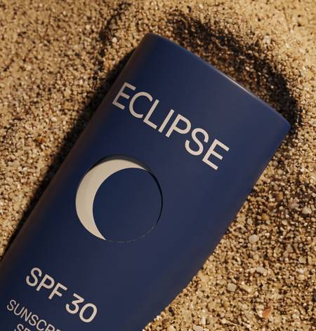
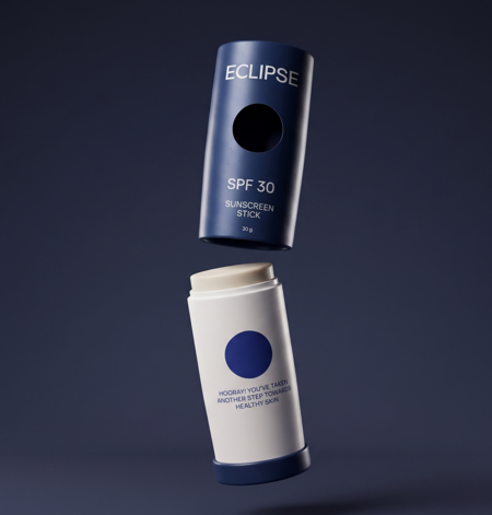
ECLIPSE: sun protection for men
branding and packaging
Problem
In Israel the sun shines all year round, yet men ignore protection. Products on the shelf look either like women’s cosmetics or like pharmacy goods, and that creates resistance
Concept
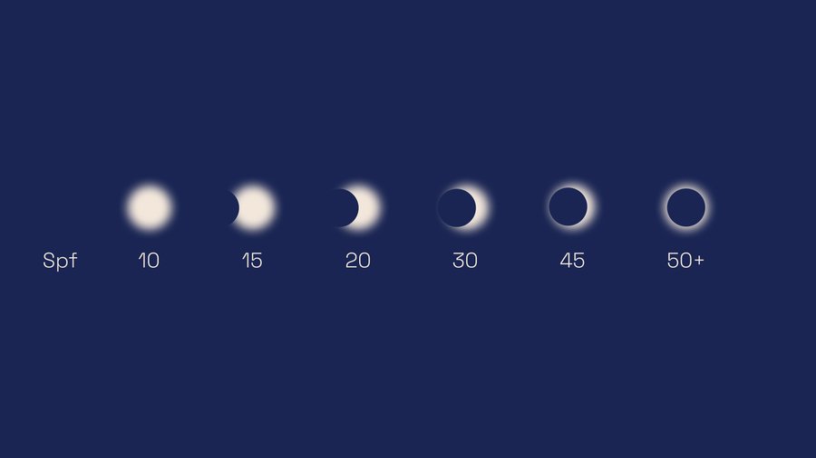
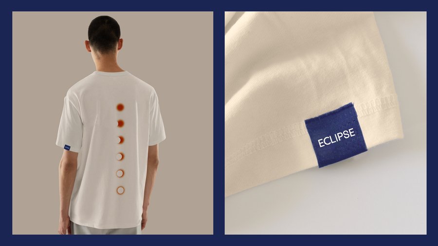
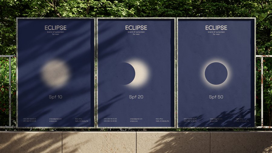
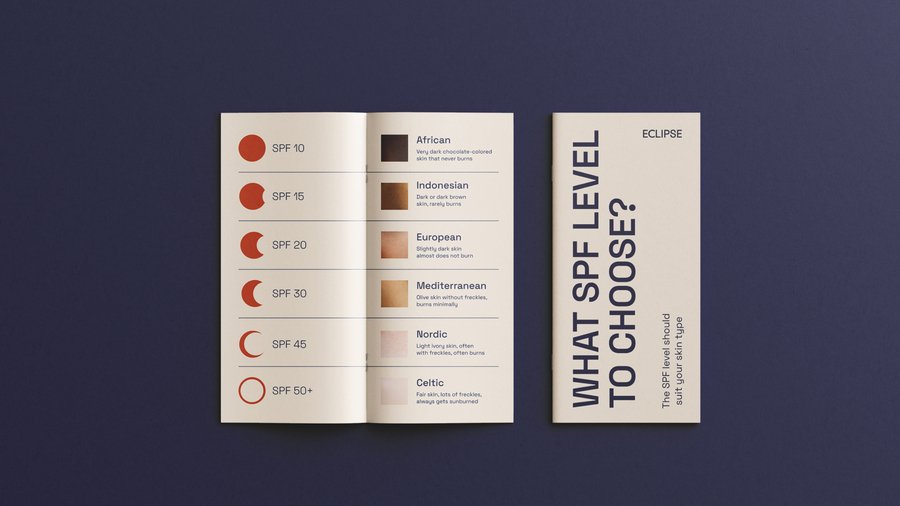
An eclipse is a natural phenomenon that covers the sun. Simple, wordless, pure physics and character. The metaphor became the base of the entire visual language and the packaging mechanics
Character
Confident energy and elegant simplicity. Everyday packaging that asks nothing of the user


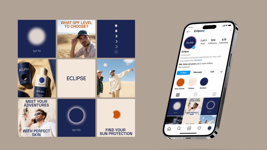
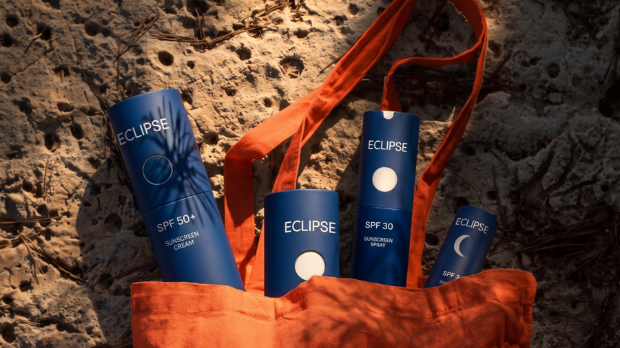
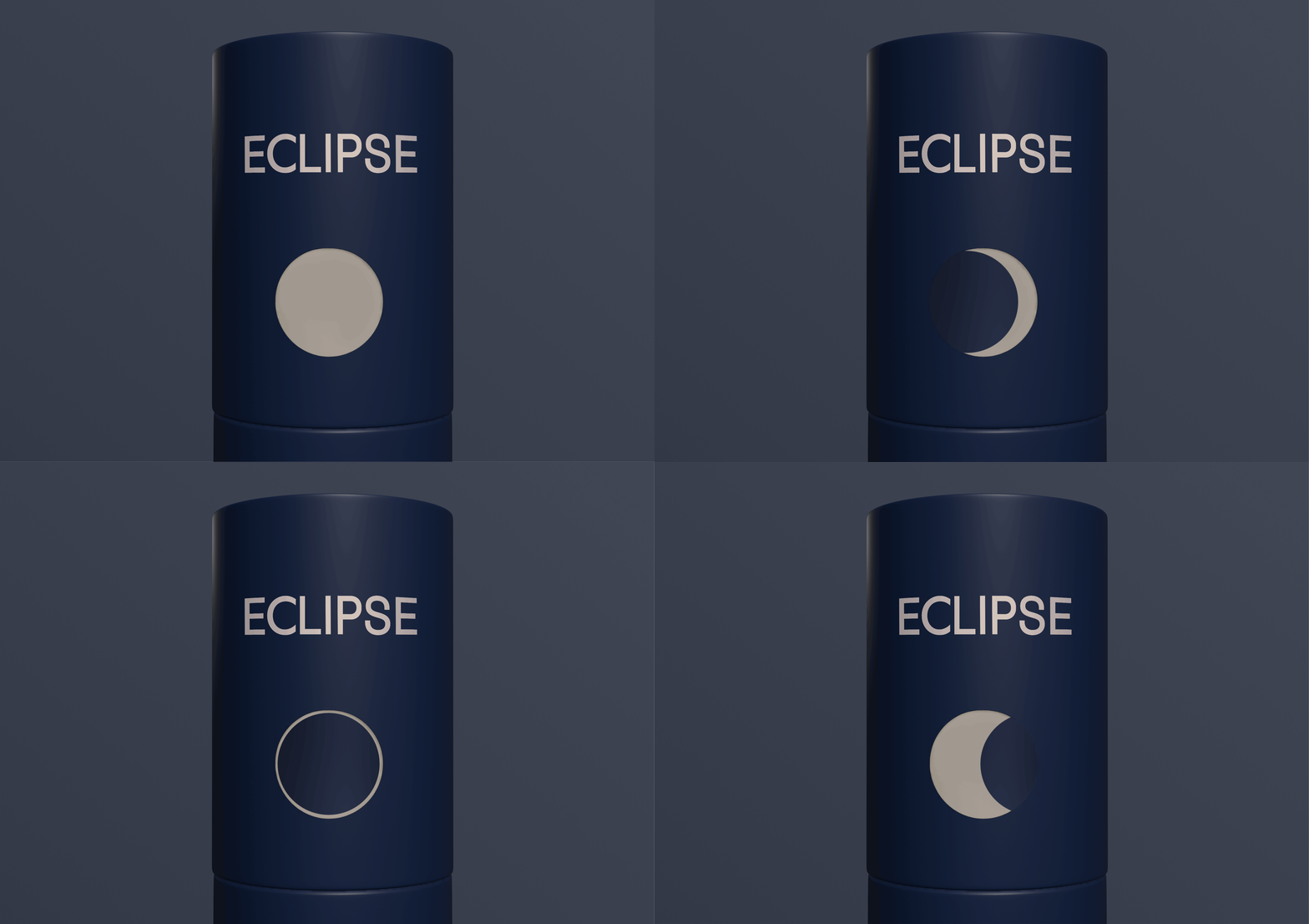
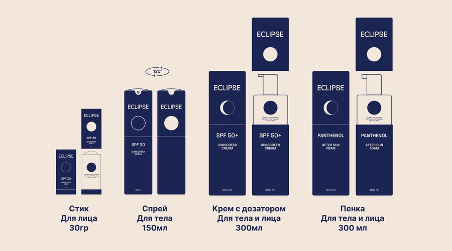
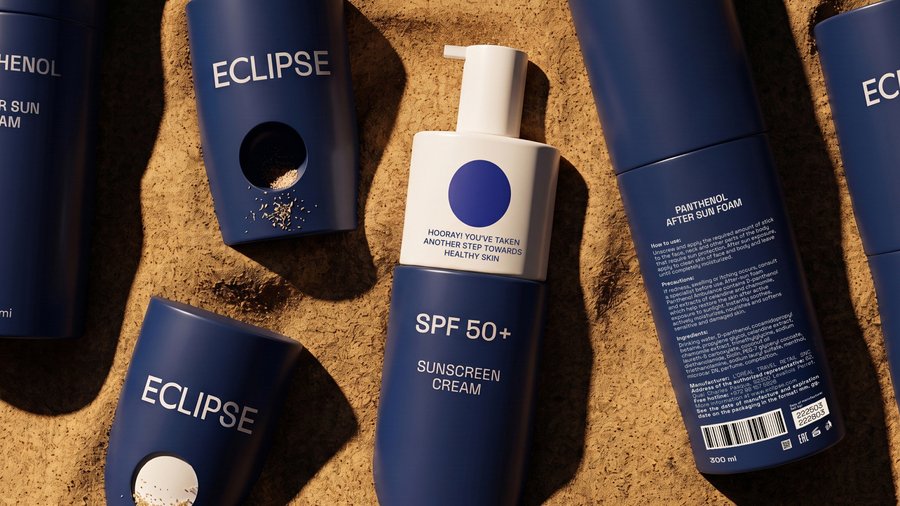
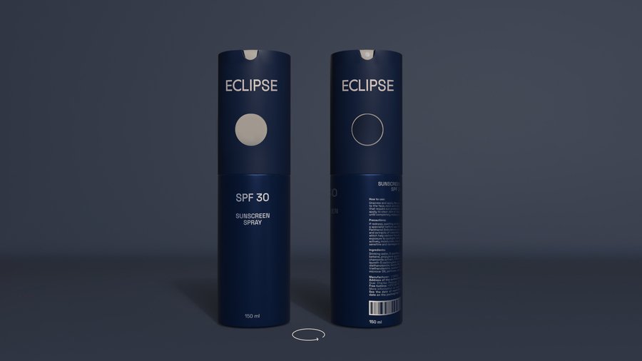

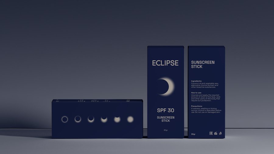
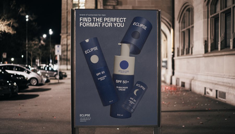
1/15
Result
Concept project, tested on a shelf mock-up with 12 men aged 25–40. 10 read the packaging as protection rather than cosmetics; 8 would pick it up without hesitation. The eclipse reads at a glance and takes the product out of the white-and-yellow blur on the shelf
GENEROUS BOOKSTORE: a charity book market
identity redesign
Исходный размер 1920x1294
Problem
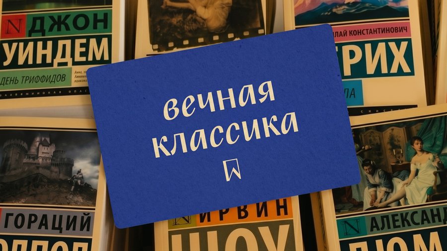
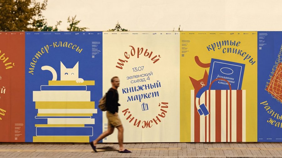
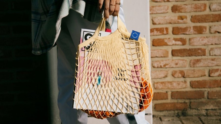
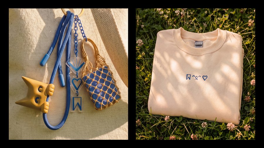
The market has a strong concept: accessible books, thoughtful curation, a warm atmosphere, and a charitable component. However, the visual identity failed to convey this tone or link the event to the organizer’s brand
Concept
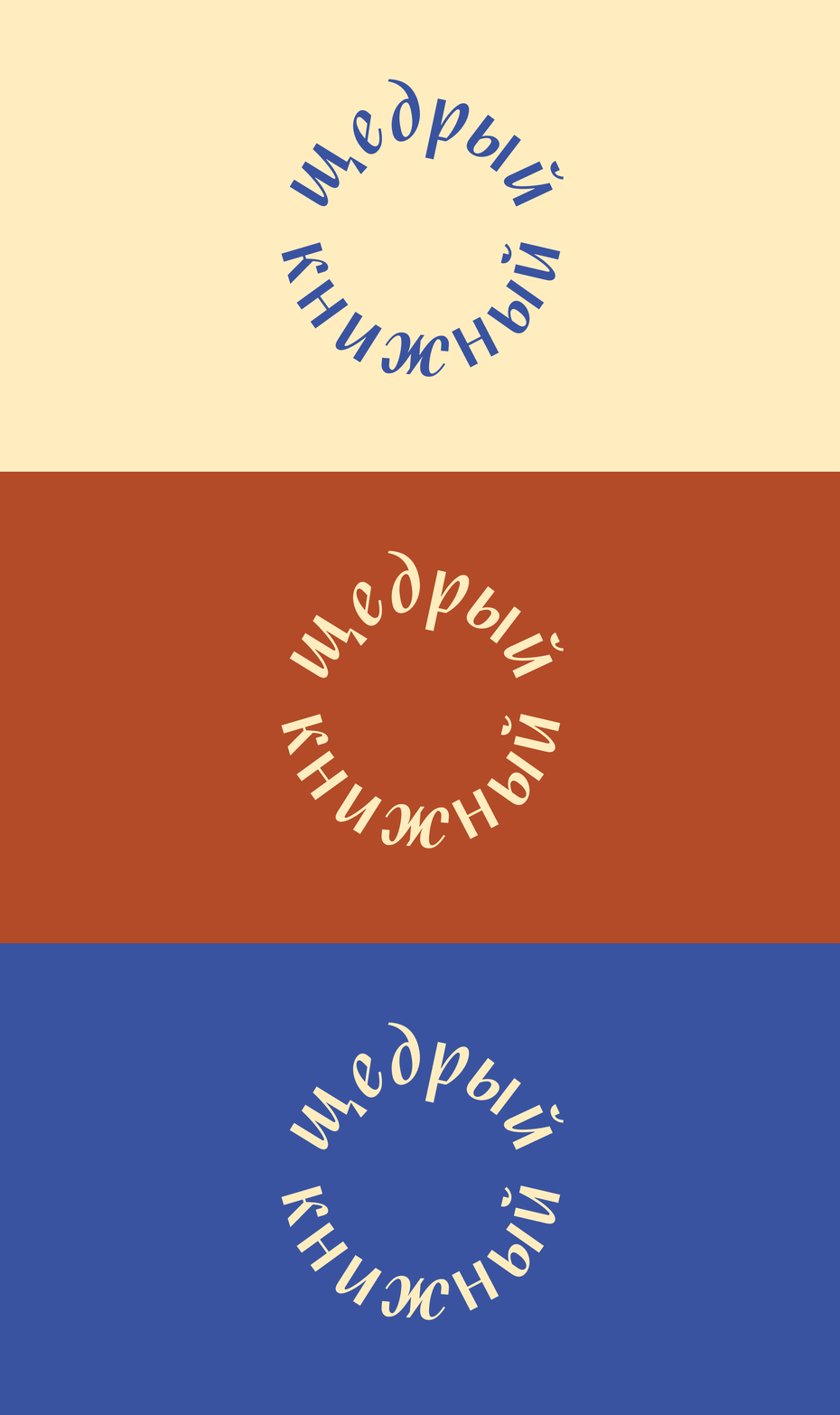
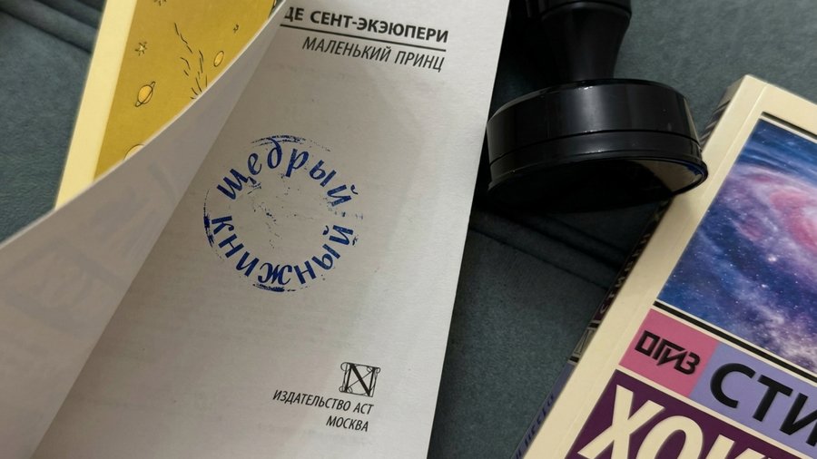
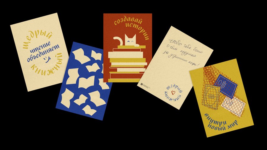
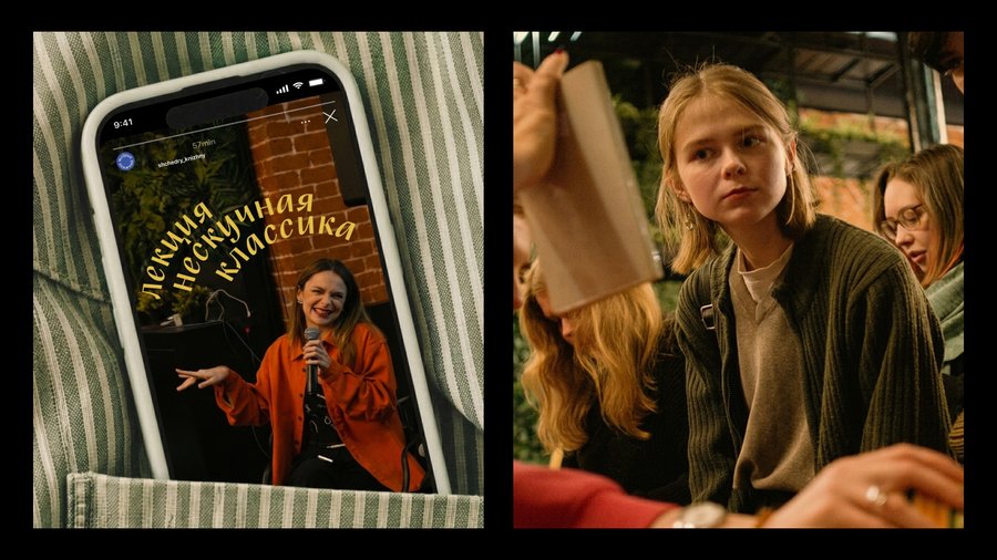
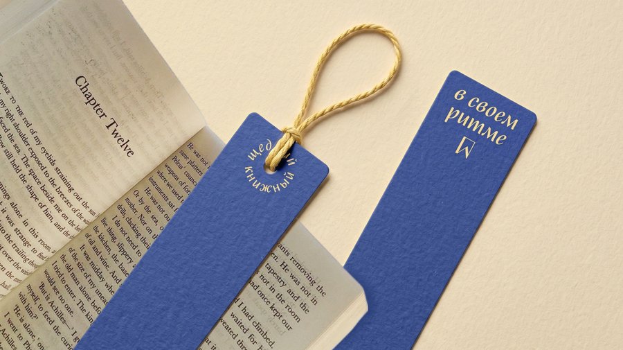
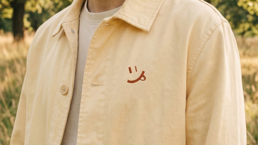
Every book here goes through careful curation, so the identity is built on the idea of a stamp — a mark of quality and a sign of belonging to the market. The logo form echoes the organiser’s identity and refers to book culture: publishing marks and ex libris
Character
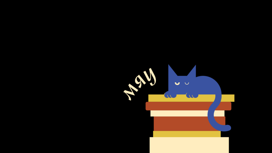
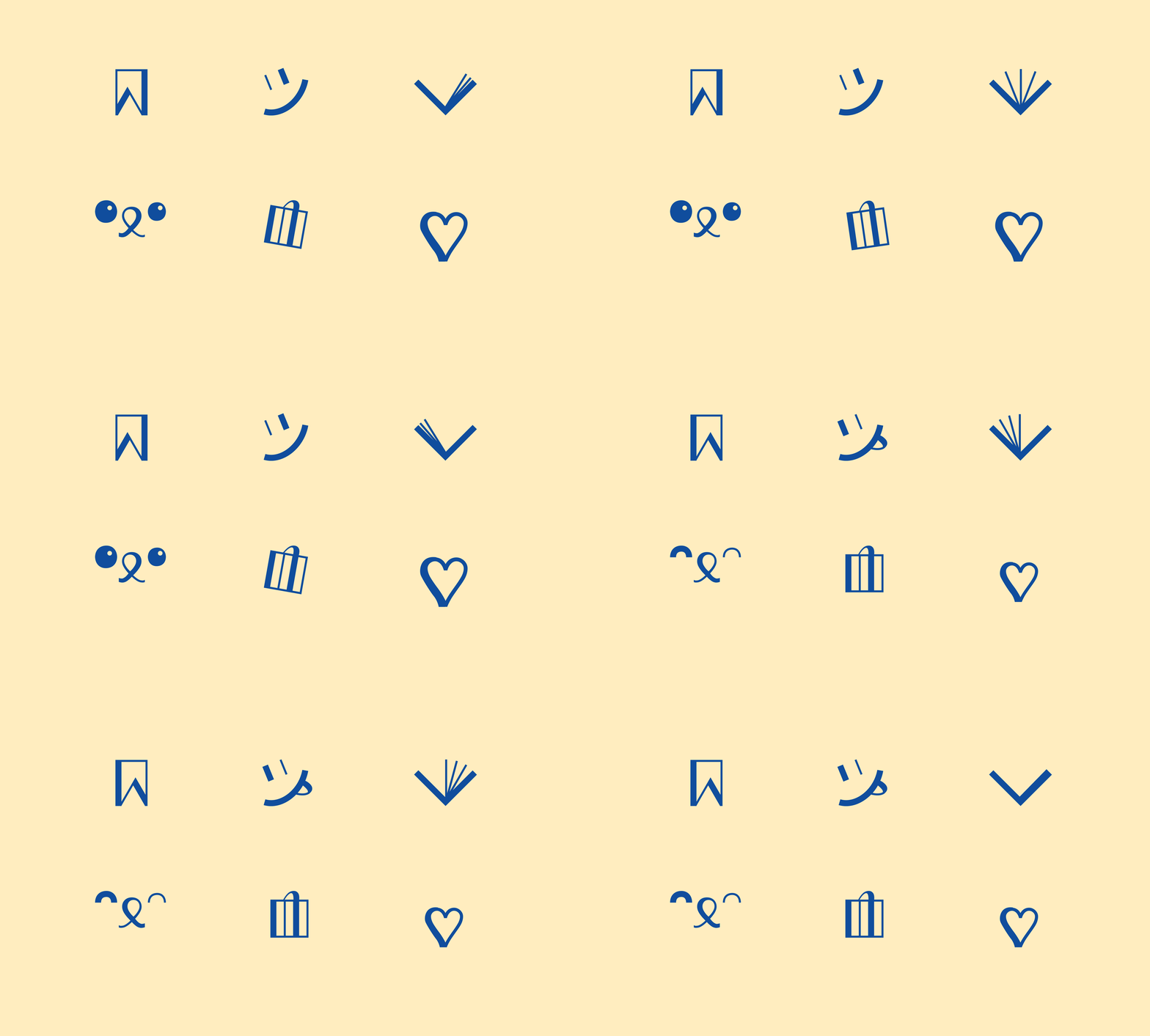
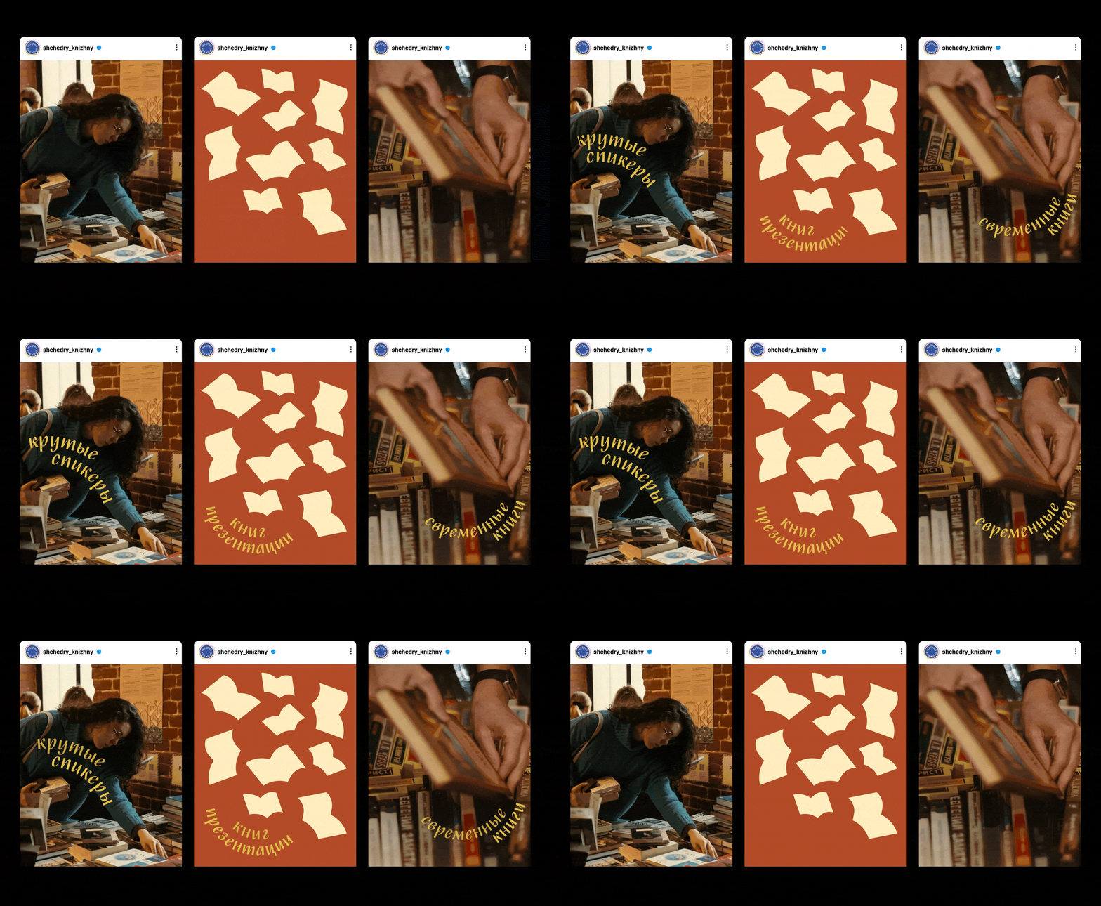
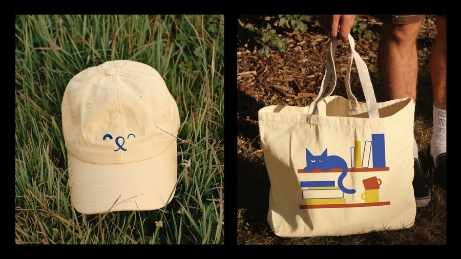
The additional icons are built using contrasting stroke weights, which creates a sense of rhythm and visual harmony with the typography. A cozy, homey atmosphere is brought in by a character—a cat whose shape evokes a bookmark. This character embodies the marketplace’s core values: generosity, warmth, and care for the reader
1/14
Result
Feedback from the organizer: «A very cohesive, wonderful project—the colors, fonts, and illustrations are all highly pleasing to the eye. I tried to find something to critique, but there was simply nothing to complain about.» The market team decided to keep the concept for future events and invited the designers to work on upcoming design requests for the center, even though a different visual identity was chosen for this year’s edition
«Karandash-Fest 2026»
series of posters
Исходный размер 2380x1800
Problem
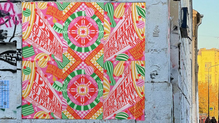
Following the first festival, the visual language—comprising clown figures and urban symbols—was perceived as being for a children’s event, even though half the audience consisted of adults. With 2026 marking the 125th anniversary of the birth of Karandash [the famous clown], the promotional materials needed to avoid appearing exclusively for children, while remaining contemporary, vibrant, and cheerful
Concept
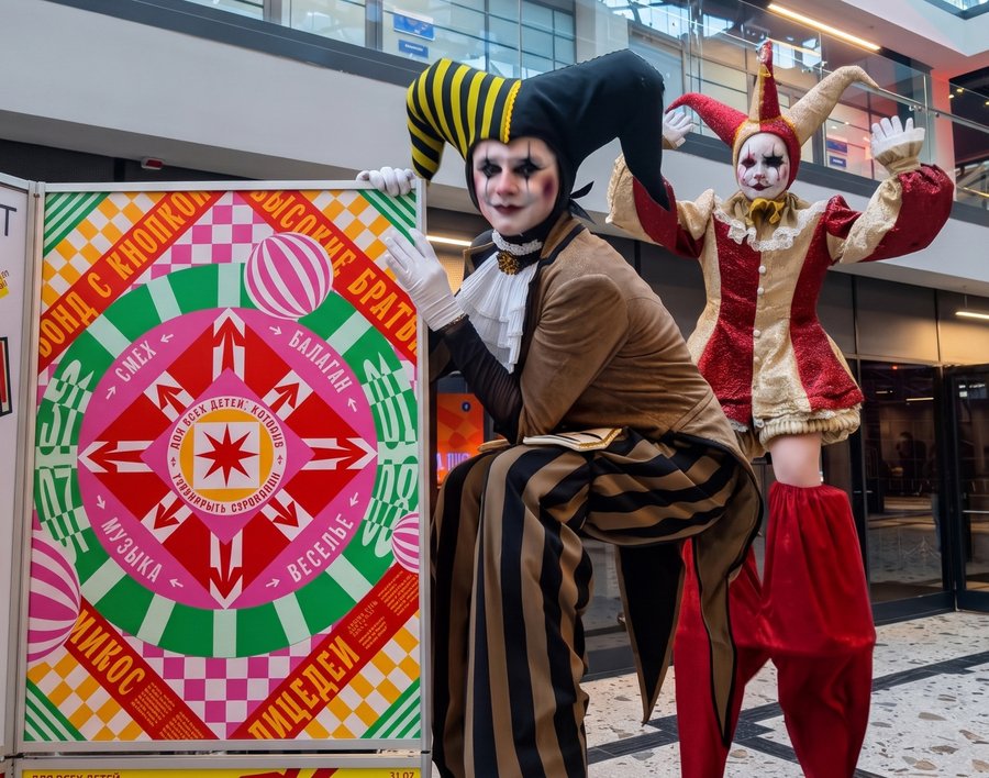
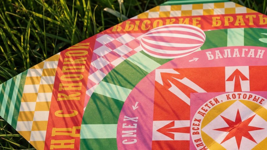
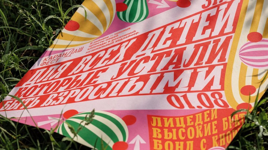
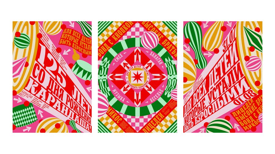
A reimagining of the vintage poster through the lens of pop art. The fairground—conceived as chaos and energy—is expressed through geometric patterns, saturated color, and dynamic typography, entirely devoid of literal depictions of clowns or urban landmarks. The slogan serves as the primary visual element, allowing the poster to assert the festival’s ethos rather than merely describing it
Character
Bright, loud, geometric. Radial compositions and diagonal typography draw the eye toward the center, then fling it back out—the rhythm of a fair
1/5
Result
The shortlist for the «Karandash-Fest 2026» open poster competition. Printed in A0 format and displayed at an exhibition. Three posters, one cohesive system: they read as a series from across the street, yet reveal distinct individual personalities up close
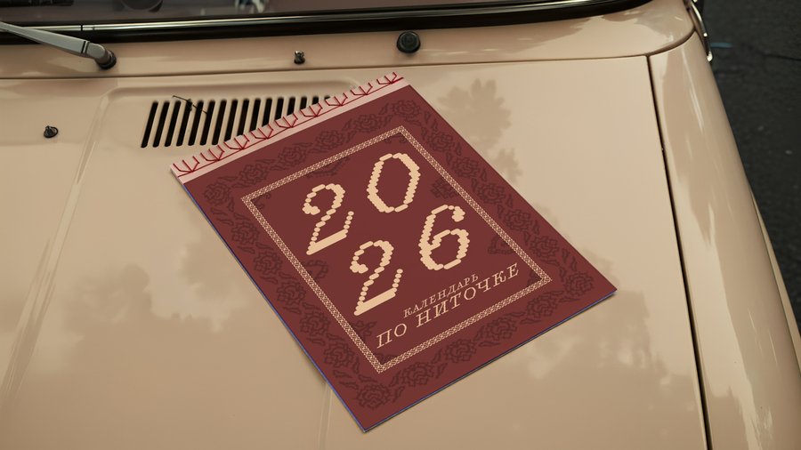
Thread by Thread: a calendar about carpets
calendar design
Исходный размер 1920x1294
Problem
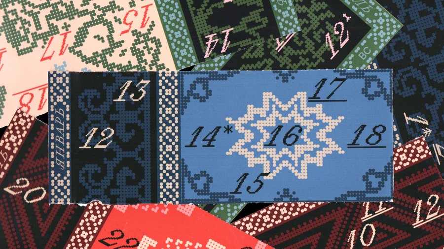
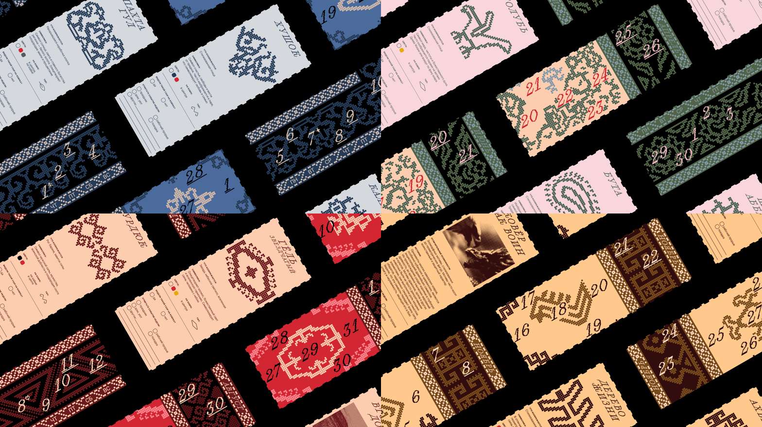
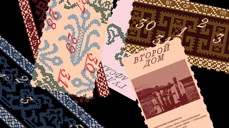
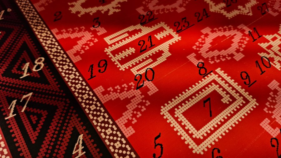
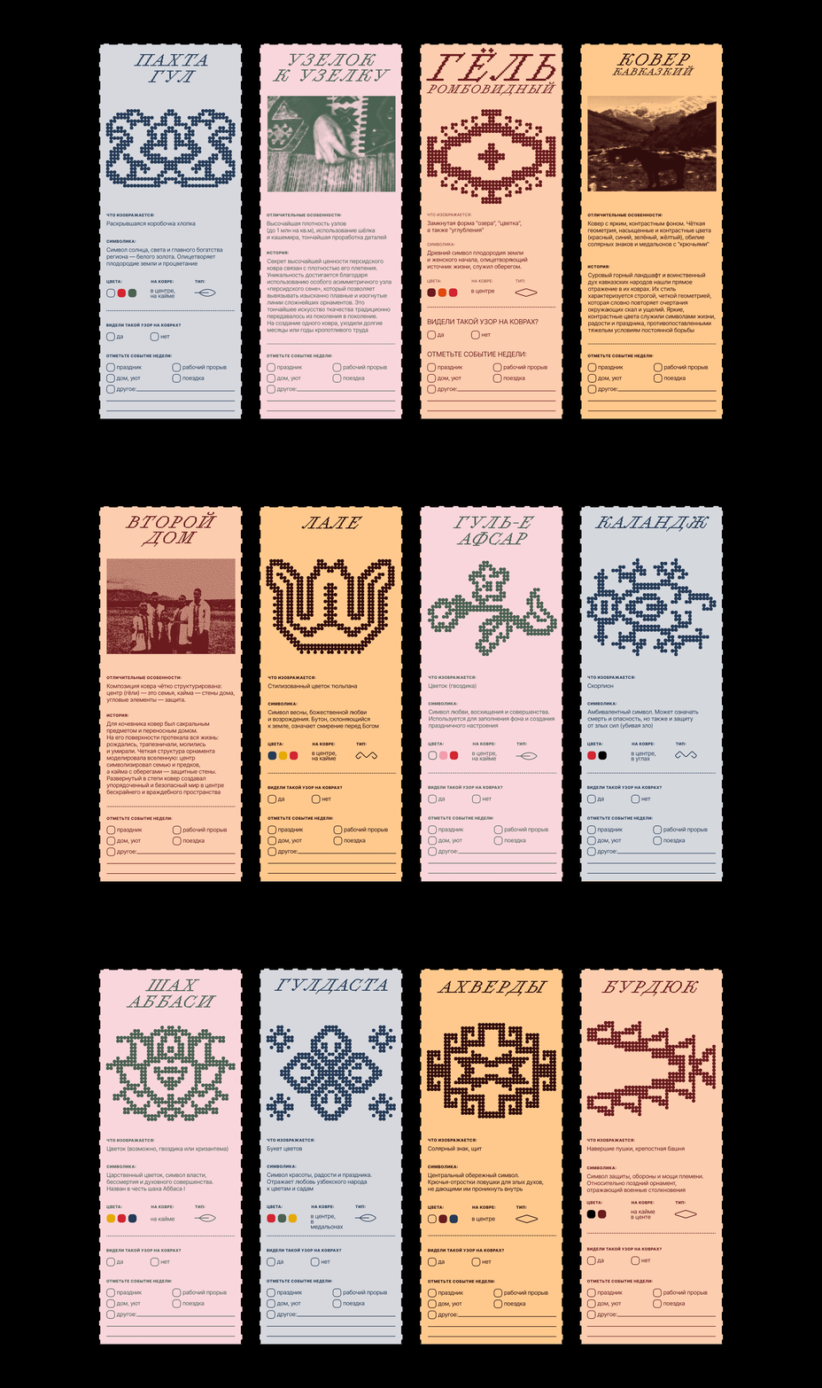
A tear-off calendar is purely functional, with nothing about it that invites one to keep it. A carpet, on the other hand—the most commonplace object in a home—carries an entire language of symbols that almost no one knows how to read anymore
Concept
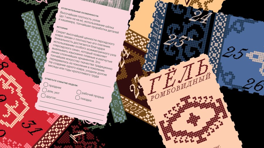
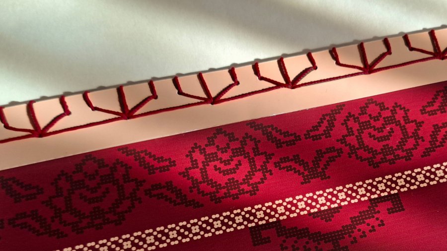
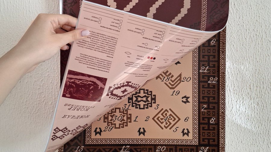
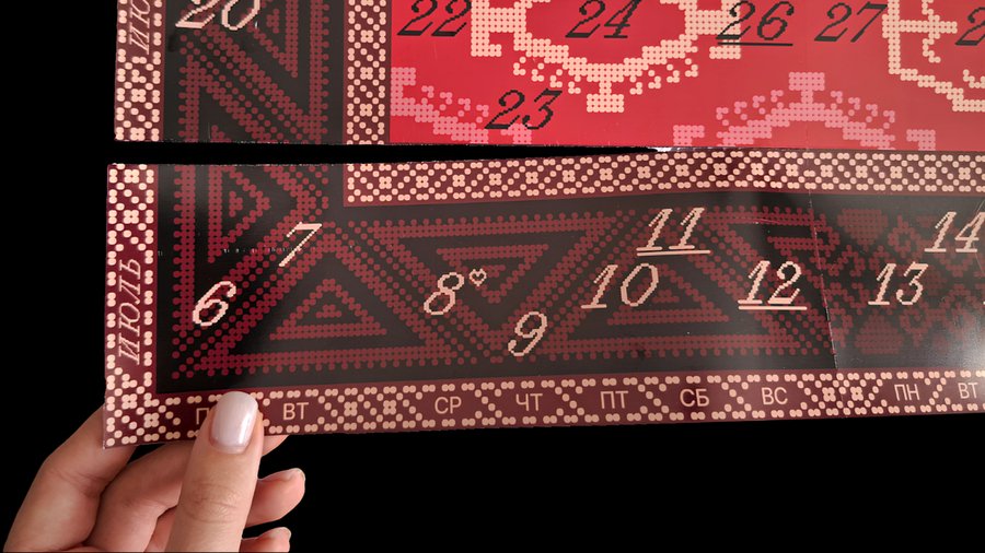
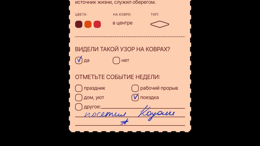
This calendar reveals the secret language of carpets. It is a weekly tear-off calendar: each card features a pattern on the front, while the back explains the symbol’s meaning or tells a story, with space provided to record your own memories from that week
Character
Warm and nostalgic. The tone evokes childhood: you drift off to sleep while gazing at a rug, transported into a world of fantasy. The fonts and dot-matrix graphics are a nod to the art of weaving
1/11
Result
Printed and produced. The calendar hangs at home and is used every week; one copy is mine, while several others were given as gifts and now hold the memories of other people
WHAT ELSE I CAN DO


How I Work
Tools
Исходный размер 1920x1300