Nigeria Meal Poundo Yam
Poundo food Packaging Design Analysis
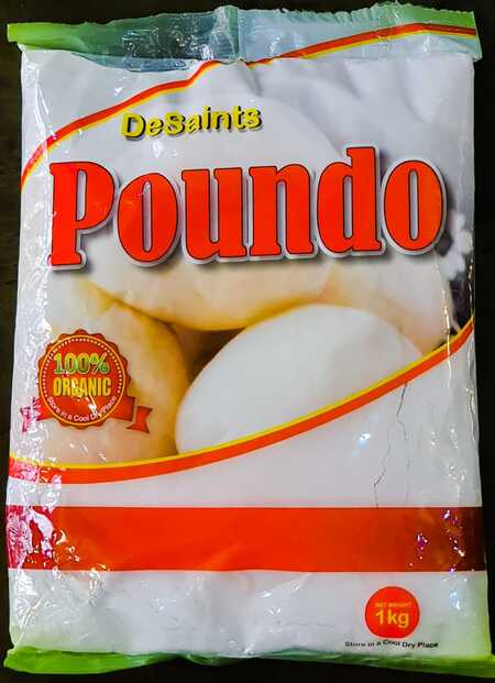
Core Identity: Minimalist, «clean-label» design targeting a premium, health-conscious audience. It rebrands a traditional food (yam flour) with a modern, global aesthetic.
Key Design Elements & Intent:
· Color Palette: White (purity/cleanliness), earth tones (brown/green for natural/organic). · Typography: Serif «DeSaint’s» (heritage) + bold sans-serif «Poundo» (clarity). Clear visual hierarchy. · Layout: Asymmetrical with dynamic illustration; heavy use of white space for premium feel. · Imagery: Stylized, textured illustration (artisanal, tactile) over a photo. · Badge: «100% ORGANIC» seal (key selling point/trust). · Form: Stand-up pouch (modern, practical, fresh).
Why It Works: Visually distinct, communicates «pure» and «trustworthy» instantly, appeals to organic shoppers.
Project Angles: Line extension redesign, comparative analysis with traditional packaging, sustainability audit of materials, cultural critique of «premiumization.»