Aesop — австралийский бренд skincare, haircare и fragrance-продукции, основанный в 1987 году.

ключевое позиционирование
Бренд позиционирует себя как интеллектуальный, минималистичный, чувственный и ориентированный на образ жизни. Его также можно описать как пример премиальной «медленной роскоши».
Aesop продает не только косметику. Он предлагает целостный опыт: ритуал, атмосферу, эстетическое впечатление, чувство спокойствия и даже архитектурное окружение.
целевая аудитория
• молодые professionals • люди из creative industries • дизайнеры • архитекторы • аудитория slow living • люди с высоким визуальным вкусом

каналы коммуникации
Основные платформы: • Instagram • Website • YouTube • Email newsletters
НО: очень важно — бренд почти не использует TikTok-style aggressive marketing.
PR-стратегия
PR-стратегия Aesop строится на сдержанности, а не на громкой рекламе. Бренд избегает агрессивного продвижения, кампаний с участием знаменитостей и визуального шума. Вместо этого он выстраивает коммуникацию через архитектуру, атмосферу, тексты в редакционном стиле и целостную визуальную идентичность.
архитектура магазинов как PR Магазины Aesop работают не только как точки продаж, но и как медиа-пространства. Они передают ценности бренда через материалы, свет и связь с локальным контекстом.
редакционная коммуникация Сайт и описания продуктов Aesop больше напоминают культурный журнал, чем типичный beauty-маркетинг.
визуальная сдержанность Бренд использует спокойные цвета, минималистичный дизайн и тихий тон коммуникации, чтобы выделяться на фоне шумной beauty-индустрии.
последовательность во всех каналах Instagram, упаковка, магазины и сайт используют единый утончённый, минималистичный и дизайн-ориентированный визуальный язык.
что особенного в коммуникации?
- архитектура магазинов как медиа. Так, каждый магазин Aesop уникален. Они работают с:
• локальными архитекторами • контекстом города • материалами • светом • тактильные ощущения
Магазин становится частью коммуникации бренда.
- slow communication
Бренд:
• почти не кричит • не использует яркие акции • избегает визуального шума
Это противопоставление mass-market digital culture.
- интеллектуальный tone of voice
Тексты бренда:
• литературные • спокойные • сложные • «музейные» по настроению
теоретическая основа
ТЕОРИЯ: Uses and Gratifications Theory
Пользователи взаимодействуют с Aesop не только ради покупки. Они получают:
• эстетическое удовольствие • чувство принадлежности к определённой культурной группе • эмоциональное спокойствие • визуальное вдохновение • aspirational lifestyle
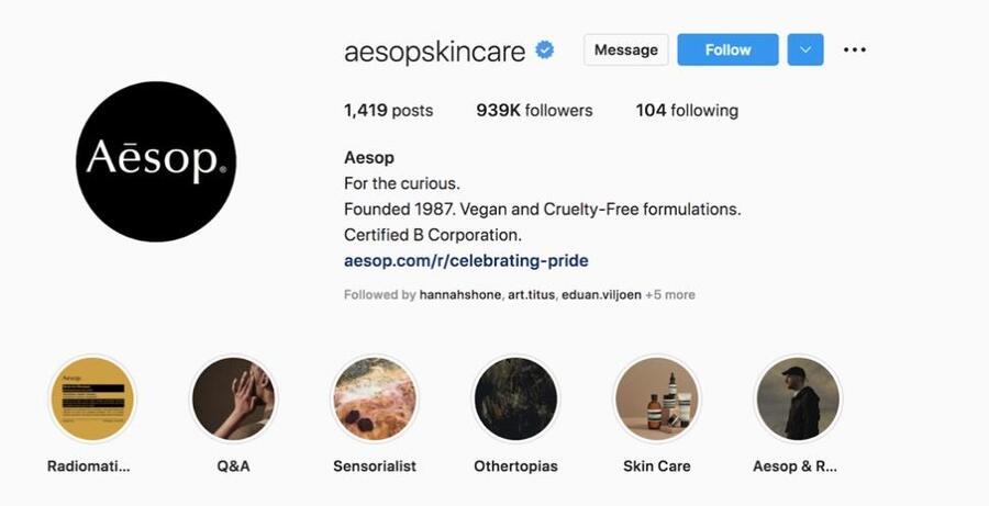
Визуальное доказательство: скриншот Instagram Story бренда Aesop Теория: Uses and Gratifications Theory / Теория использования и удовлетворения потребностей
Instagram Story бренда Aesop работает не только как рекламное сообщение, но и как краткий эстетический опыт. Сдержанная композиция, спокойные цвета, минимальное количество текста и визуальный акцент на атмосфере позволяют аудитории получать не только информацию о продукте. С точки зрения Uses and Gratifications Theory, пользователи взаимодействуют с таким контентом, потому что он даёт им визуальное вдохновение, эмоциональное спокойствие и ощущение принадлежности к утончённому образу жизни, ассоциирующемуся с брендом.
ТЕОРИЯ: Elaboration Likelihood Model
Aesop использует: peripheral persuasion. Бренд убеждает через:
• атмосферу • материал • архитектуру • фотографию • свет • типографику
А НЕ через:
• агрессивные скидки • рациональные аргументы • прямую рекламу
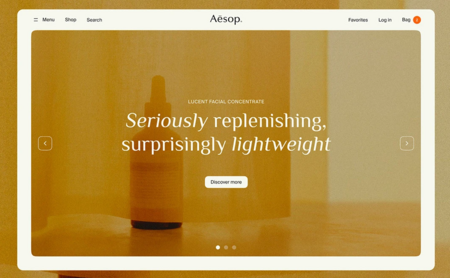
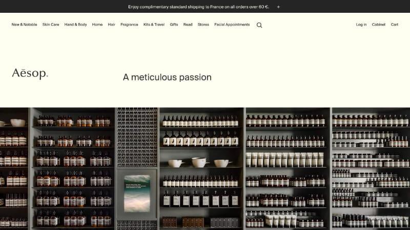
Визуальное доказательство: скриншот главной страницы сайта Aesop Теория: Elaboration Likelihood Model / Модель вероятности осознанной обработки информации
Этот баннер сайта демонстрирует использование периферийного пути убеждения. Aesop не опирается на агрессивную рекламу, яркие рекламные сообщения или скидочные призывы. Вместо этого бренд воздействует на зрителя через тёплые янтарные оттенки, мягкий свет, минималистичный интерфейс, элегантную типографику и спокойную презентацию продукта. Эти визуальные сигналы формируют ассоциации с доверием, утончённостью, сенсорным удовольствием и премиальным уходом.
Фраза «Seriously replenishing, surprisingly lightweight» также даёт пользователю небольшое рациональное сообщение о продукте, однако основной убеждающий эффект создаётся именно атмосферой страницы. С точки зрения Elaboration Likelihood Model, Aesop преимущественно использует периферийный путь: аудитория воспринимает бренд через настроение, визуальный стиль и эстетический опыт ещё до детального анализа самого продукта.
анализ
- INSTAGRAM КАК ВИЗУАЛЬНОЕ ПРОСТРАНСТВО
Instagram Aesop работает не только как рекламная платформа, но и как тщательно выстроенное визуальное пространство. Бренд использует приглушённые цвета, минималистичные композиции, тактильные текстуры и архитектурные кадры. В результате лента бренда больше напоминает редакционный журнал или дизайн-архив, чем типичный аккаунт косметического бренда.
Отсутствие ярких цветов, агрессивных слоганов и чрезмерного продвижения продуктов создаёт ощущение спокойствия и визуальной дисциплины. С точки зрения теории коммуникации, такая стратегия поддерживает периферийное убеждение: аудитория воспринимает бренд не через прямые рациональные аргументы, а через атмосферу, настроение и эстетические ассоциации.
Instagram Aesop также удовлетворяет потребность аудитории в визуальном вдохновении и культурной принадлежности. Пользователи взаимодействуют с брендом, потому что он представляет определённый образ жизни: спокойный, интеллектуальный, утончённый и ориентированный на дизайн.
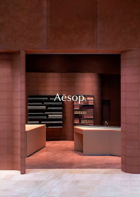
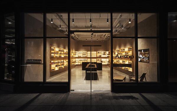
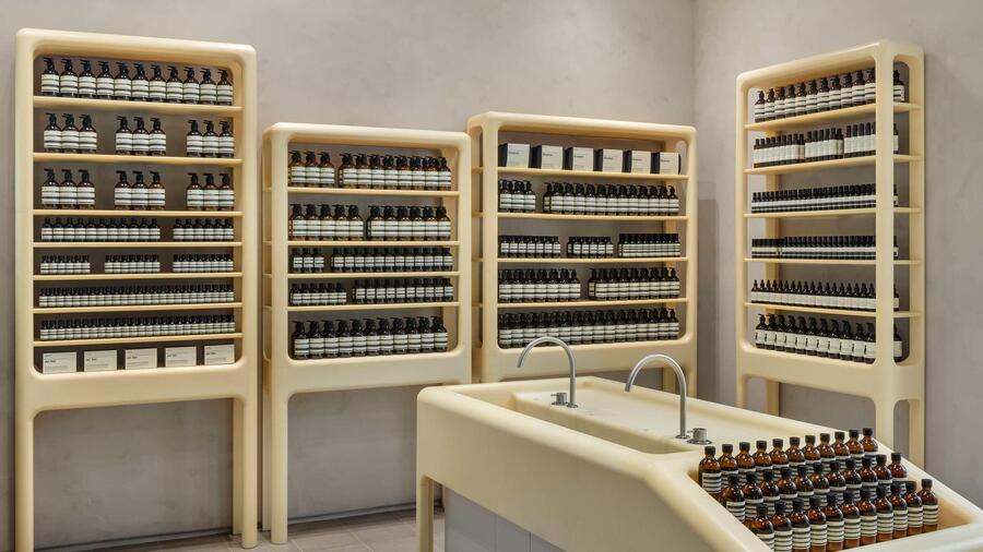
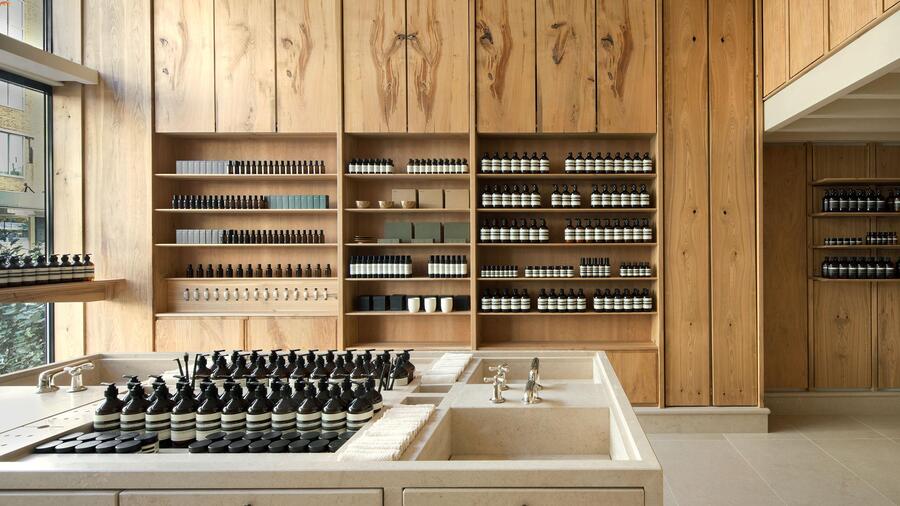
- ИНТЕРЬЕРЫ МАГАЗИНОВ
Магазины Aesop являются одной из важнейших частей коммуникационной стратегии бренда. Каждый магазин спроектирован не как стандартное торговое пространство, а как уникальный пространственный опыт. Бренд часто использует бетон, дерево, металл, локальные материалы, мягкое освещение и тактильные поверхности.
Эти интерьеры передают ценности бренда через пространство. Они создают ощущение спокойствия, внимания к деталям, честности материалов и интеллектуальной роскоши. Покупатель не просто заходит в магазин — он попадает в тщательно спроектированную среду, которая продолжает идентичность бренда.
Это особенно важно, потому что магазин становится средством коммуникации. Архитектура, материалы и свет работают как визуальные и сенсорные сообщения. Они помогают Aesop выделяться среди массовых косметических брендов и формировать более глубокую эмоциональную связь с аудиторией.
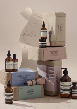
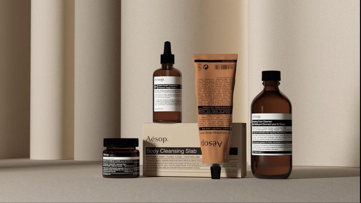
- УПАКОВКА
Упаковка Aesop — один из самых сильных элементов визуальной идентичности бренда. Янтарные флаконы, минималистичные этикетки, простая типографика и сдержанная цветовая палитра создают ассоциации с аптечной эстетикой, наукой и профессиональным уходом за кожей.
Упаковка не выглядит чрезмерно декоративной или подчеркнуто женственной. Вместо этого она транслирует серьёзность, интеллектуальность и функциональность. Благодаря этому продукт воспринимается как надёжный и вне времени.
С точки зрения модели вероятности обработки информации, упаковка работает как периферийный сигнал. Ещё до прочтения описания продукта потребитель получает сообщение через форму, цвет, материал и типографику. Продукт воспринимается как утончённый, эффективный и эстетически выверенный.
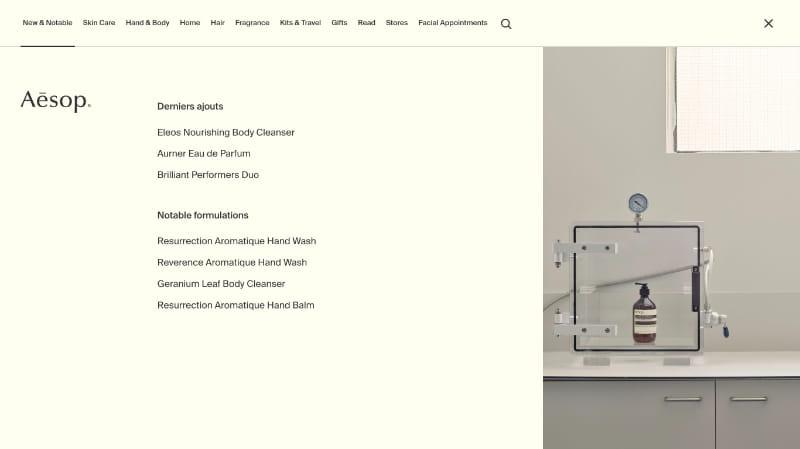
- САЙТ И ПОЛЬЗОВАТЕЛЬСКИЙ ИНТЕРФЕЙС
Сайт Aesop продолжает ту же коммуникационную логику, что и магазины, Instagram и упаковка. Интерфейс выглядит спокойным, чистым и визуально сдержанным. Он избегает визуальной перегруженности и не давит на пользователя агрессивными всплывающими окнами, яркими баннерами или хаотичными рекламными сообщениями.
Сайт больше напоминает редакционную платформу, чем типичную страницу интернет-магазина. Информация о продуктах подаётся аккуратно, с вниманием к типографике, свободному пространству и визуальной иерархии. Это создаёт более медленный и вдумчивый пользовательский опыт.
Спокойный UX поддерживает идентичность бренда как slow luxury. Он позволяет пользователю изучать продукты, ритуалы и категории без ощущения перегруза. Таким образом, сайт транслирует те же ценности, что и физические магазины: ясность, спокойствие, интеллектуальность и эстетическую дисциплину.
заключение и рекомендации
Коммуникационная стратегия Aesop является эффективной, потому что она создаёт сильную эмоциональную и культурную идентичность бренда. Aesop не просто продаёт продукты для ухода за кожей, волосами или парфюмерию. Бренд продаёт образ жизни, основанный на спокойствии, ритуале, эстетическом опыте и интеллектуальной роскоши.
Aesop выделяется на фоне шумного digital-маркетинга благодаря сдержанному визуальному языку, минималистичной упаковке, архитектурно выразительным магазинам и спокойному tone of voice. С точки зрения теории использования и удовлетворения, аудитория взаимодействует с брендом, чтобы получить эстетическое удовольствие, эмоциональное спокойствие, визуальное вдохновение и чувство культурной принадлежности.
Модель вероятности обработки информации также помогает объяснить стратегию Aesop. Бренд в основном использует периферийное убеждение: он воздействует на аудиторию через атмосферу, материалы, архитектуру, фотографию, свет и типографику, а не через агрессивные скидки, прямую рекламу или рациональные аргументы.
Однако Aesop мог бы улучшить свою коммуникацию, сделав её более интерактивной, сохранив при этом свою медленную и утончённую идентичность. Бренд мог бы усилить присутствие в TikTok через спокойные эстетичные видео о ритуалах, текстурах, интерьерах и материалах.
Также Aesop мог бы развивать более диалоговую коммуникацию с аудиторией: использовать форматы Q&A, закулисный контент, беседы с архитекторами и интерактивные гиды по уходу за кожей.
В целом стратегия Aesop работает, потому что она выстраивает цельный мир спокойствия, интеллектуальности и сенсорного опыта. Главная задача бренда — стать более вовлекающим, не потеряв при этом свою узнаваемую сдержанность и эстетическую ясность.


