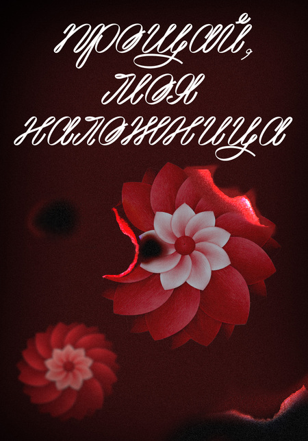
The brand of the film Farewell My Concubine is focused on preserving and reinterpreting cultural heritage amid historical and ideological transformations. Its aim is to capture the vulnerability of traditional art and emphasize the value of form as a carrier of memory.
The brand establishes a connection with Russian culture through a shared historical experience of rupture with tradition, characteristic of both countries in the 20th century. In both the Russian and Chinese contexts, revolutionary changes led to similar cultural consequences: the loss of continuity, the rethinking of artistic forms, and the subordination of art to new ideological demands. The brand’s character can be described as restrained and contemplative; its emotional depth is conveyed not through overt expression, but through an attentive treatment of detail and the use of pauses.
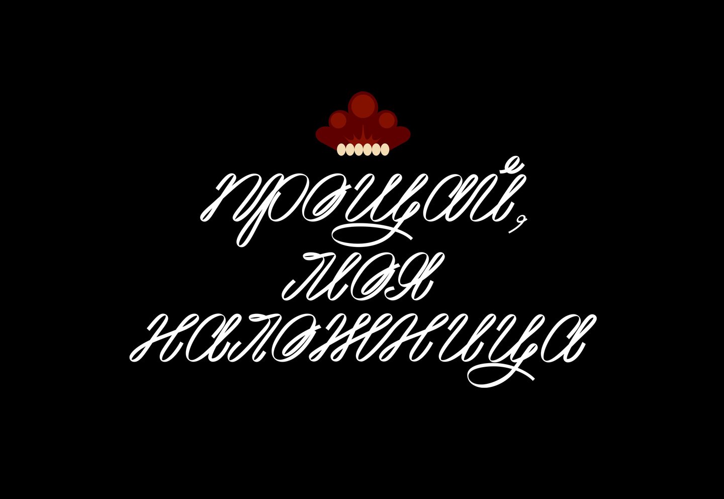
The logo mark is built on the fusion of two cultural forms. Its silhouette simultaneously references the traditional Russian headdress—the kokoshnik—and a Beijing opera costume element associated with the actor’s headwear. The typographic part of the logo follows the same logic: the typeface, developed on the basis of the Ruff font, is inspired by the ribbons and sashes of garments. It is paired with the Felidae typeface.
The brand identity is grounded in elements of Beijing opera costume, understood as a primary bearer of the film’s cultural code. Particular emphasis is placed on textile embroidery, approached not merely as ornament, but as a structured system of meanings and symbols embedded in Chinese cultural tradition and theatrical practice. Motifs such as chrysanthemums and peonies, cranes and clouds are drawn from authentic opera costumes and recontextualized as visual signifiers of enduring values— status, continuity, and spiritual order. Destruction within the visual identity is articulated through the motif of burning, which functions both as a direct reference to the film and as a universal metaphor for loss. Marks of charring, rupture, and the erosion of form are employed to evoke the violent interruption of national and cultural continuity.
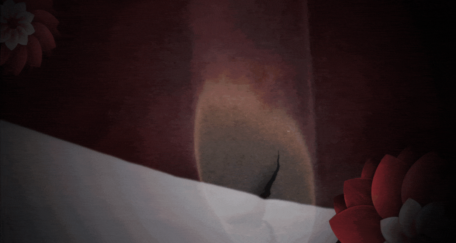
Within the film’s visual identity, the opening credits were designed to extend and reinforce its conceptual narrative.
The merchandise developed as part of the film’s brand fosters a dialogue between Chinese and Russian cultures. It is based on a juxtaposition of objects related to theater, costume, and everyday traditions in both countries, which have undergone similar historical ruptures.


