The key question is, «If the meaning and spirit of this film were to become a modern Brenda, what would it look like?» «Asterix and Obelix: The Cleopatra Mission» is not just a comedy, but a metaphor for any grand, absurd and collective undertaking where the process completely replaces the goal and the participants are bound by a common field of fun chaos.
Brand strategy: vision, values, positioning
Vision: Turn the film into an interactive universe of absurdity, where you can sink into a chaotic race like a ride and test it on yourself. Values: Interactiveness, friendship, game absurdity, visual dynamics, collective laughter, enjoyment of the process against the result. Positioning: Brand is a guide to the philosophy of conscious and joyful acceptance of chaos. It’s a community of people who can laugh at the inevitable failure of plans, not because they appreciate the outcome, but the quality of the process itself and the people in it. Brenda gives permission to be inimical, celebrates a beautiful failure, and recalls that the strongest connections do not arise in triumph, but in sharing the consequences of epic failure. The slogan is, «OH, COME ON. WRONG. Let’s hear it again.»
Logotype and Graphic World
Logo: Implemented in the form of multicolored pre-assembly units, as parts of a designer that look like they’ve just been shook. The name «Asterix & Obelix» appears in the typeface, where each letter is a «construction block» with random punctures and cracks.
Excise font: Created on the basis of geometric grotesque. Its speciality is variable: the letters are represented in a «destructed» form, and they are collected from different pieces. Main font: Helvetica Neue is a pure, readable, classic grotesque.
Full graphic identity: humbor, idea, color palette
The idea is that I rethinked the movie by seeing not a story about winning the Gauls, but a satirian for the process itself. The comedy has become a philosophical statement about our obsession with grand projects and the fact that real magic is not in a magic potion, but in our ability to laugh when everything falls apart, and to continue building, knowing that it will have to be fixed tomorrow. Forms: Geometric blocks, debris, silhouette of broken statues, Egyptian frescoes. The images of the film — the beginning of the construction and the first moments of destruction — are two points in one absurd cycle: the moment of the highest effort and the moment of their instant collapse. Between them, the whole story of the movie. The key graphical element: The stylized, cartoonic eyes of characters looking at chaos with the expression of comedian surprise are the connecting element of the identics from poster to merch.
Color palette: The warm tones of sand and clay belong to Egypt, which is the very material of the palace that is trying to build. They’re facing the cold shades of galley armor. These two gammas don’t mix, they run into each other. The overall dustyness of the palette conveys the sense of endless, exhausting work under the burning sun.
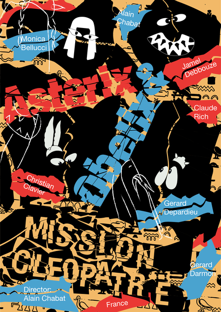
Poster
The poster is composed around the shape of a broken vessel — a fragile symbol of the palace itself. The font and geometric blocks, as if the stone plates were colliding and cracking, visually passing a grueling and absurd race between creation and destruction. The scene where Asterix, Obelix, and Panoramix are trapped in the pyramid has been reworked in a poster to the very essence of their broad, cartoonic eyes. The look from the dungeon and the look from the throne mirror each other — they all look at a situation that they do not control with the same comical tension. It’s a visual joke that there are no winners in this race, only participants with big, surprised eyes.
The spirit of the posts is incredible confidence in absurdity, as in the film. The tone doesn’t tell a joke, but notes a ridiculous and magnificent fact — the palace is built, everything is falling apart, and it’s a perfectly normal development. The phrases sound like they could have been spoken by a voice that commented on an epic failure with unforgivability. Conventional objects (machine, fists, pyramids) are shown from flying debris, with «eyes» flowing through them.
Firm style
The park of attractions was chosen as the ideal form for translating the film’s essence — it itself is an «ever-ending structure», an interactive model of an absurd race, where physical action (up, down, finding a path) directly conveys the emotion of an endless process.
All the elements of the identics are the expression of the concept of the eternal race. The design of each object is based on the impact of a clear shape and destruction, as well as on a key graphical element — the mirror cartoon eyes of this race. There’s nothing static and complete in this mediocrity. Each item is seized at the moment of transformation — observation, destruction and disappearance. It creates a coherent universe where the concept works at all levels, from a grand ride to a drink cup, creating a holistic impression. Design principles: Blocity: Style elements (logotypes, patterns) are collected as a designer from building blocks. Detachment: Fractures and chips are applied to these blocks. Color: Contamination of warm sand, red (Egypt) and cold steel (Gallia) palettes. Graphics: Recognized «eyes» of heroes as a symbol of general confusion. Elements of merchandising: A food kiosk: A sand stand visualizes the conflict: Asterix and Obelix on various sides of the counter as symbols of strategy and chaos. Ticket: Implemented in the form of a monolithic plate collected from numerous colour blocks, each breaking a deep crack. Gas: The label is a stylized image of a monumental stone block split in half by a deep crack. Asterix and Obelix are on different sides of the split. The logo is handwritten in a dynamic, live type, which is as if placed on top of a stone. This manuscript contrasts with geometry. Black hat with a picture of Asterix’s eye. A guest wearing a cap takes on the role of looking from inside the system, which analyzes, but may not always intervene. T-shirt: White cotton T-shirt depicting the destruction process. Large blocks of images are separated from each other, creating a sense of instability and incomplete destruction. A sandy bag with a pint stylized to the cracked Egyptian fresco. The logo is placed above the pattern by hand, with a dynamic stroke, creating a sense of ancient graffiti. Entry bracelet: Silicon bracelet with a park logo in combination of warm and cold flowers. The logo letters on it are almost disappearing, erasing. It’s ironic about short-lived. Ice cream and popcorn: United by the principle of typographical destruction: the names on the cups are marked with sharp fragments.


