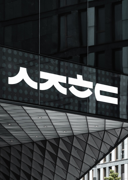
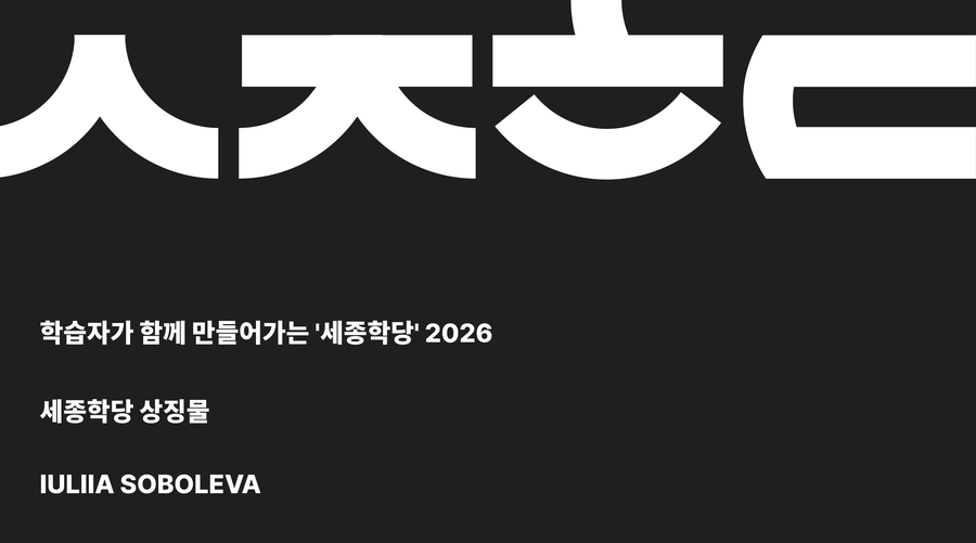
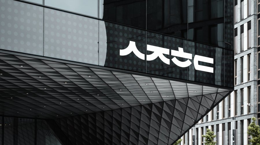
Work for the logo redesign competition for the King Sejong Institute Foundation
The font for the logo was created by hand using simple elements that repeat from letter to letter, similar to the original method of creating 한글. The first consonants from each syllable of 세종학당 were used as a basis
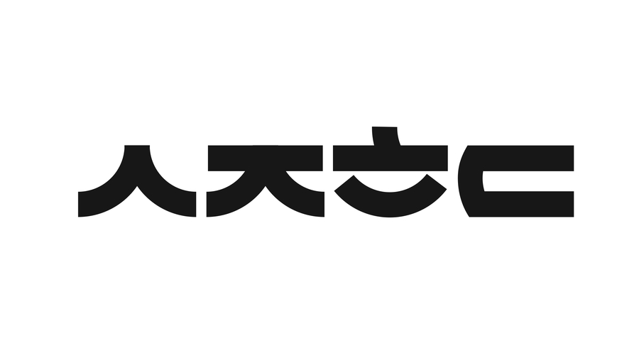
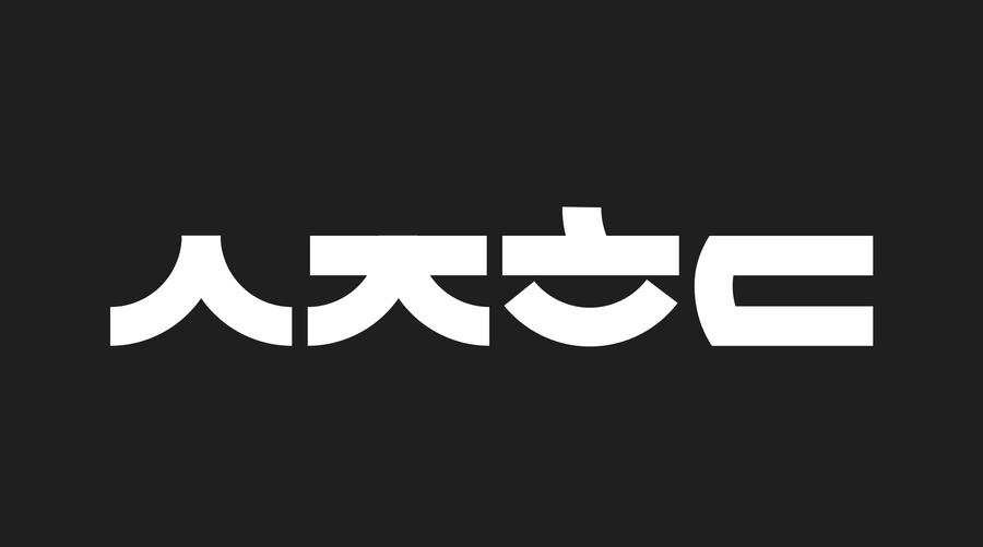
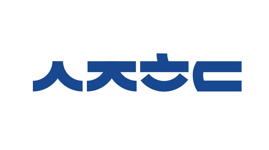
The horizontal logo is inspired by the rounded tiles 수막새 on the roofs of Korean traditional architecture. The lower part of the letters and their rounded parts come together in a pattern like tiles. The first color, graphite, is also associated with tiles. The added blue color for the black and white logo pair is both a symbol of stability, professionalism, trust and an association with the Korean sea and sky
The vertical logo is based on the idea of a stack of books, with an open book on top — the letter ㅅ. It also resembles a pagoda, as a repository of the treasures of the Korean language