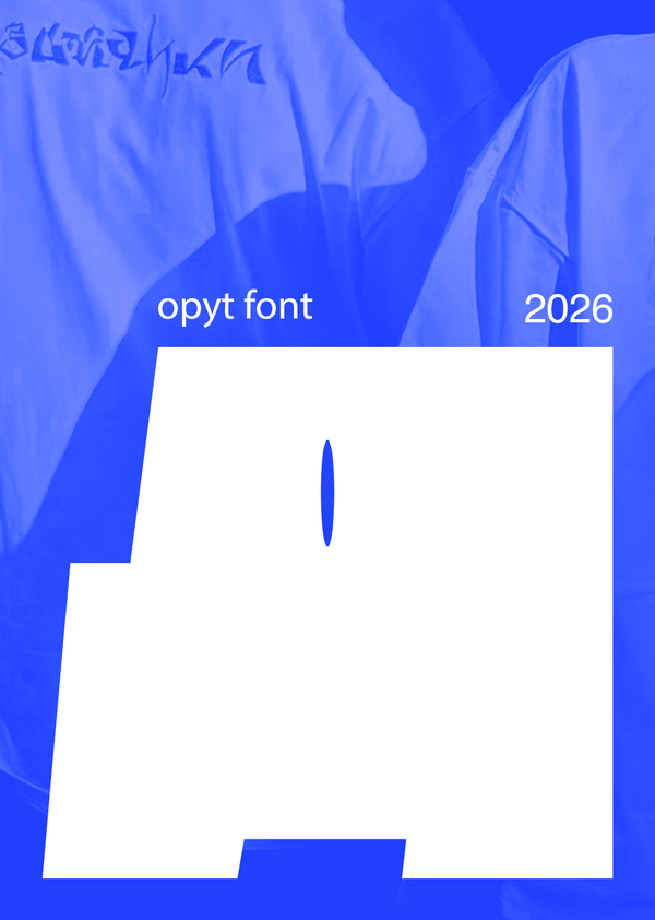
OPYT is a font family built on a metaphor for human memory. Unlike traditional garrisons seeking visual unity, OPYT explores the nature of subjectivity and the diversity of memories.
Development and creation of font
Project objective and objective:
Develop an OPYT (OPYT) typeface, consisting of three contrasting drawings. The main technical task is to systematize the material collected (letters created as part of the daily «33 letters in 33 days») by selecting and distributing the symbols. The project aims to study human memory through a printed visual language. We have shown that memories differ in importance and have internal hierarchy and texture. The font is an expression tool: basic memories are transmitted by massive grotes, emotional peaks are sharp forms, and slipping moments are transmitted by light and thin lines. A personal contribution to the project: 9 individuals from the BLD251 group participated in the development of the project, divided into three teams, each of which took one drawing from the letters created during the shuttle with the technology Boris Zabatsky. — Sophia Zaitsa: responsible for the selection of letters, the technical uploading of the font to Fontlab, the creation and printing of the sticker pack, the presentation. — Cyril Lebedev: responsible for the creation of posters, the merch, the photo/video filming of the media and the design of the presentation. — Mecharina Maria: responsible for creating the animations and making the presentation. The work has resulted in the creation of a full-scale font family consisting of three drawings: Opyt Base, Opyt Flash and Opyt Trace, which are technically correct and ready for use in digital media. There was no direct coordination on the part of the ECU.The starting point of the project was the mantle proposed by our technologist: in the first module, we created one letter of the Russian alphabet every day. Each liter was performed by different students of the BDL 251 group in different styles and emotional states, which symbolizes diversity and multiple voices of perception.
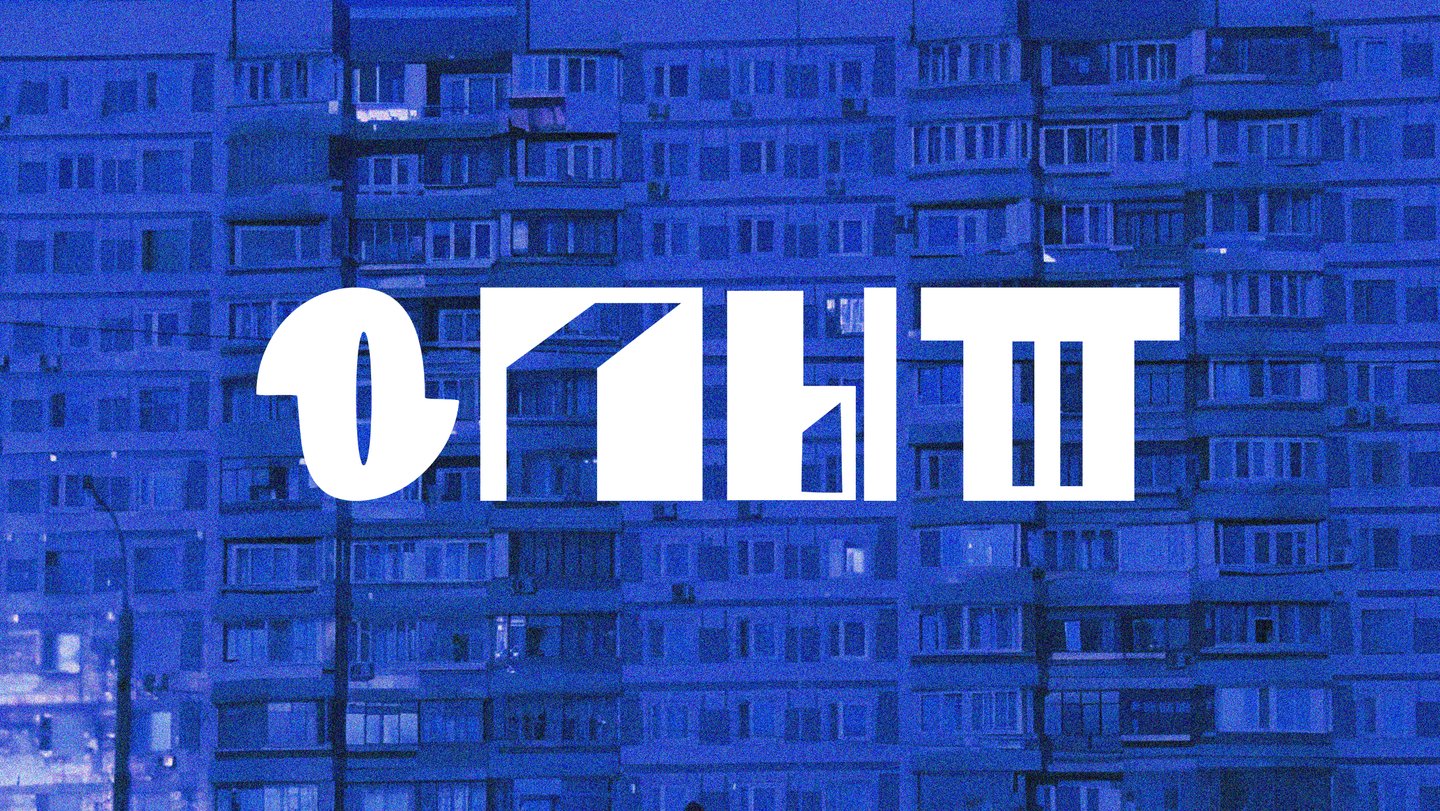
The HEAVY drawing represents the foundation, the foundation of memory. The memories that shape us are childhood, our mother tongue, the names of our loved ones, basic skills. Something that doesn’t require proof and isn’t erased.
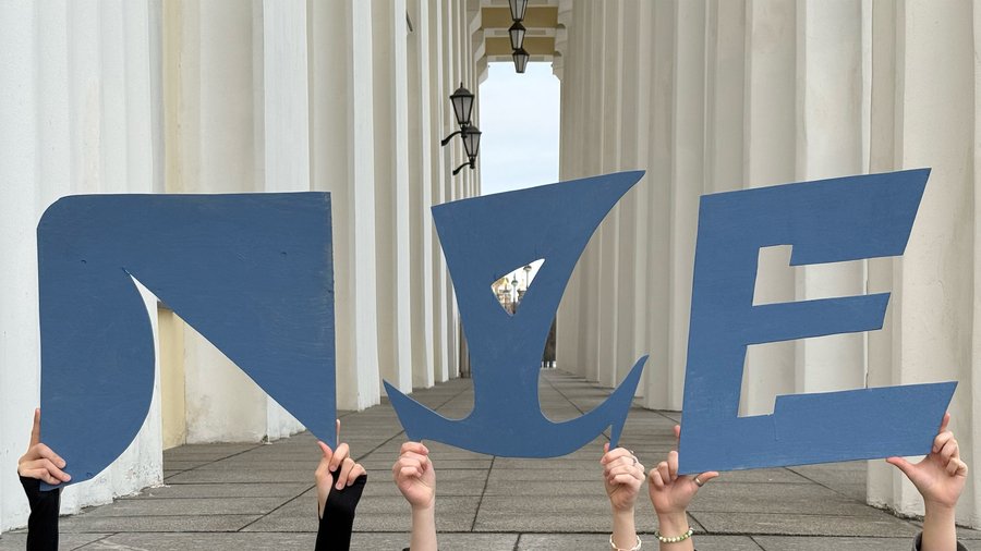
First series of posters
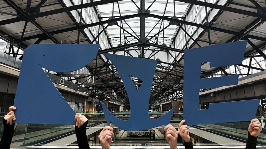
Second series of posters
Animated series
brochure
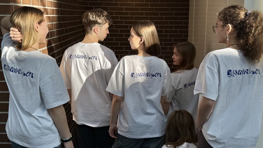
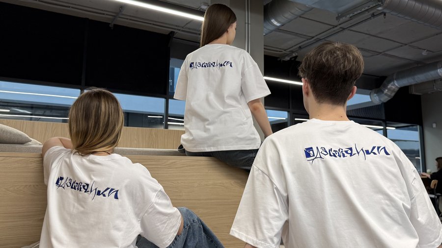
The OPYT font was created on the basis of letters invented during the shuttle, so we created T-shirts that represent our entire group, the OBD.
T-shirts embroidery process
merch
Stickerpack
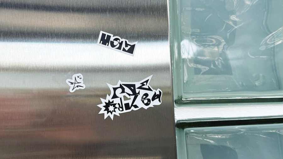
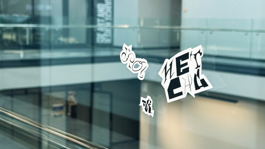
There’s a QR code on the stickers that allows you to go to the website about our font.
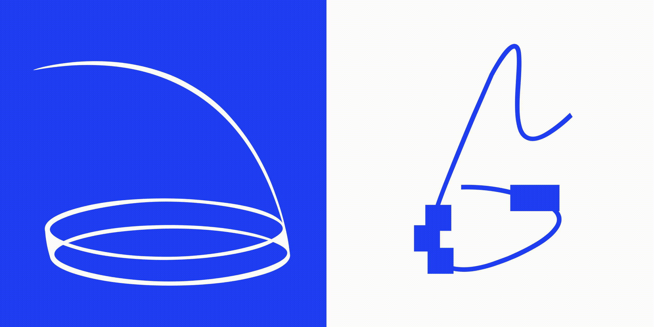
Clocks