В последнее время, я склоняюсь к традиционному взгляду на типографику, будь то традиции ренессанса или модернизма, в любом случае опора на культурный / исторический код важна. Поэтому старостильные антиквы (или Гаральды) для меня — основа типографики.
Ян Ван Кримпен // Брам Де Дус
Ян Ван Кримпен и Брам Де Дус — главные люди в моём шрифтовом становлении, поэтому я не нашёл ничего лучше, чем основывать проект на их работах. Мне хотелось сохранить пластику шрифтов Ван Кримпена и Де Дуса, но адаптировать формы под цифровые реалии и уделить внимание кириллице.
Семейство Trinité было взято за основу системы начертаний Rivalité. Причина этому — явный акцент на работу с набором и текстом. Именно поэтому начертания отличаются выносными элементами, жирностью и шириной очень незначительно. Так у типографа появляется возможность более тонкой настройки.
В рамках модуля получилось полностью проработать главные начертания: regular и italic. Остальные в планах доработать в ближайшем будущем.
Rivalité Roman
Пластика шрифта продиктована логикой письма ширококонечным пером. Поэтому появляются динамичные штрихи и засечки.
Асимметричные и свисающие засечки нужны для создания «динамики набора», то, что Брам Де Дус называл свингом шрифта.
Сверху — финальная версия; снизу — первая версия. Помимо уточнения контуров, можно увидеть, насколько поменялось ощущение от формы засечек.
На основе докторской диссертации Франка Блокланда, «On the Origin of Patterning in Movable Latin Type»
Самая важная характеристика наборного шрифта — его ритм. Приближение к принципам паттернинга упрощает кернинг и делает набор «по-ренессансному» ровным. Также лучше выглядит выключка по формату.
Про семейство
…икс-хайт неизменно равен 500, то ширина пера будет 100 для regular (если мы говорим про антиквы). Однако возникает сложность. Перо под наклоном, а соответсвенно, ширина штриха будет меньше 100. Для корректировки есть удобная формула:
s = w • cos (a)
Где s — ширина штриха; w — ширина пера и a — угол наклона пера
Обычное и полужирные начертания имею одинаковую ширину, чтобы можно было легко их менять друг на друга и изменять насыщенность набора.
Три длины выносных элементов удобны для работы со сносками и большими текстами. Такая незначительная деталь сразу влияет на выбор интерлиньяжа, а соответсвенно и характера набора.
Капители — важный элемент традиционной типографики, к ним мы ещё вернёмся.
Лигатуры следуют длине выносных в начертаниях.
В шрифте есть инициальные (начальные) и терминальные (завершающие) формы букв, для тонких каллиграфичных настроек слов.
Универсальный набор цифр для любых наборных целей.
Все символы делятся на две группы: • Неизменно тонкие (остаются тонкими во всех начертаниях) • Изменяющиеся (меняют насыщенность согласно начертанию)
Стилистические сэте основаны на исторических формах (ноль и параграф) и попытке латинизировать формы кириллицы (к/ж)
Rivalité Italic
Говоря об италиках, большое влияние оказали шведские каллиграфы (Erik Lindegren, Kerstin Anckers, Karl-Erik Forsberg) и сами Голландцы: Брам Де Дус и Геррит Ноордзей.
Основаой пластики италика помимо работ шведских и голландских каллиграфов послужил и мой личный опыт. Буква G — яркий пример моей руки.
Италик Rivalité имеет незначительный наклон в 7°, это мало по сравнению с другими шрифтами эпохи возрождения, но приближает его к современной практике. И такой наклон лучше работает вместе с прямым начертанием в одной строке.
Некоторые прописные буквы уже имеют каллиграфичные своши.
Несмотря на споры о необходимости капителей в италиках, в Rivalité они есть, для создания почвы для новых типографических традиций.
У италика есть четвёртое начертание со свошами на выносных элементах (при этом высота выносных = высота третьего начертания.
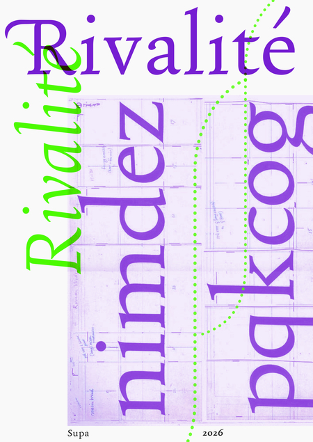
Rivalité in use
Шрифтовая касса


