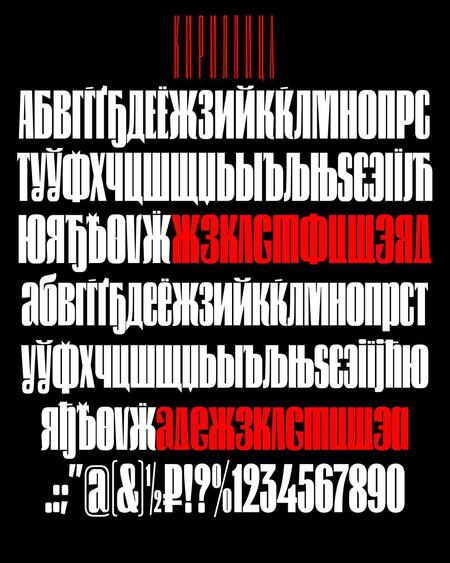
When we look at the Cyrillic in the font and try to figure out whether it’s good or not, it’s worth paying attention to a few important parameters. It’s the construction of the letters, the width of the letters, the intervals between the letters and the distribution of the thickness of the strokes.
We in Paratime’s font studio know all about these parameters. Let’s look at them in turn, and at the end we’ll talk about a few myths that we often encounter.
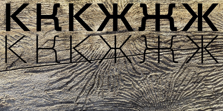
Different (and all correct) versions of the letters «g» and «k» in Hint
Marker letters
First of all, the quality of the cyrillic can be determined by the design of the letters. The most important thing is to know what to look at. There are a number of marker letters to look at: for example, B, D, L, C, J, M, F. Here are Alexandra King’s sketches for the letter «D» with an explanation of how the letter, where the forms are used, and what’s wrong with the design.
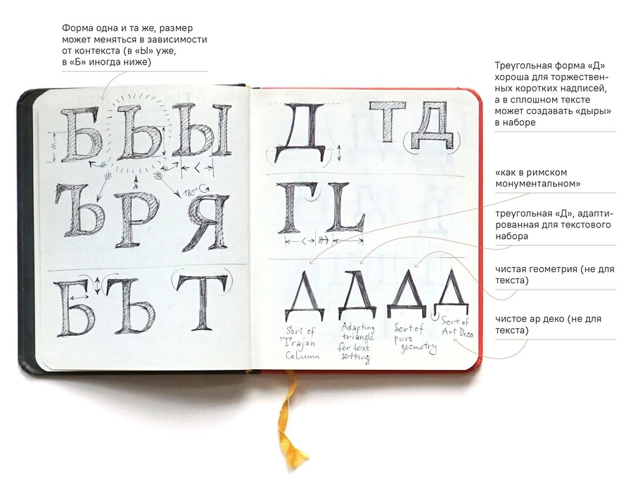
«D» usually has two shapes: trapezine and triangular. The trapezide better maintains the white balance in the row, which is appropriate for the text set. And triangular is good for short inscriptions.
On this sketch, note the angle of the left side of the letter and the options for irrational designs.
Intersections between letters and bar thickness distribution
Here’s a couple of basic rules. 1. The design of capital letters and lower case letters in the fonts of an orderly drawing shall not be mixed. If different designs are mixed in the font, it is usually not suitable for text.
The capital letters and the lowercase letters. Strangely, sometimes it’s hard to remember what straight lowercases look like (they’re different from what we write by hand) :)
- All right, all right, okay, okay, okay, okay, okay, okay, okay, okay, okay, okay, okay, okay, okay, okay, okay, okay, okay, okay, okay, okay, okay, okay, okay, okay, okay, okay, okay, okay, okay, okay, okay, okay, okay, okay, okay, okay, okay, okay, okay, okay, okay, okay, okay. The rhythm is black and white. It happens that all the letters are designly correct, but the author of the font did not think of optical compensation and the letters with the complex intersections of the strokes («in,» or «m») in the text look blacker than the others. There are also complex combinations of letters like «clad» or «ddd» — if the shape is not very balanced, there’s a «hole» between the letters, or one letter hits the other. Next time, check the selected font on this phrase:
A phrase where dangerous combinations can be tested. There shouldn’t be a hole between the letters, but they shouldn’t hit each other either.
And now it’s time for three myths about cyrillics that we often encounter :)
Myth #1. Cyril fonts are scarce
Cyril fonts aren’t that small right now, they’re worth thousands. It’s going to be about two grand, plus tens of thousands of questionable qualities. Of these two thousand decent ones, there are 200–250 free of charge for commercial use. And for any taste, from neutral and suitable groves to bizarre antiques or comic scripts.
Here’s proof of the free neutral grotesque PT Root UI.
It’s not the same typeface, but it’s also free of charge, but it’s a comic booked Bubble Sans.
Another question is that there is an information failure between fonts and users. In searchers, Pinterest, and popular social media channels, «with fonts free of charge for personal use» (this is a soft synonym of pirate fonts), there is very little information and for years the same weird fonts are chewed over. It is still better to look for good fonts on checked websites and on the subject channels about fonts and printing. We can’t resist and recommend our canal at Telegram.
Myth #2. The inscription on the Latin is always prettier.
The idea that Latin is gonna be beautiful, popular and sometimes hard to argue with is that Latin is worth more than a thousand and a half years of natural development in the design of letters, but it doesn’t follow that it would be bad if you dialed the text with cyrillics. Cyrillyceum can certainly be made beautifully, but there is a possibility that font designers will have to think a little bit more about the typeface, and graphically about its use in the project. But you can see it as an interesting mantle, not an obstacle :)
Here’s an example of graceful piloting, the logo of a typeface designer, Bella Teaeva, for a gastro-beater, «The Bunner.»
Myth #3. In the same font, the cyrillica loses the latinum.
If the font designer is a professional who loves and understands the Cyrillic, she’s gonna be fine and she’s not gonna lose to the latinum.
Ligatures in Latin and Cyrillic in Kudry (Ligatura is a sign combining two or more letters. As a rule, in the league, signs change their shape in relation to their own version)
An exception may be the case where we have to type a large inscription that works best with plastic curved lines, and the words are composed exclusively of pieces of straight lines. Then you’re gonna have to pull out a graphic designer — for example, instead of using italics, or, if you can, change the big text :)
Latinica and Cyrillic in Manul
Author: Alexandra Korollova Editor: Daria Savina


